
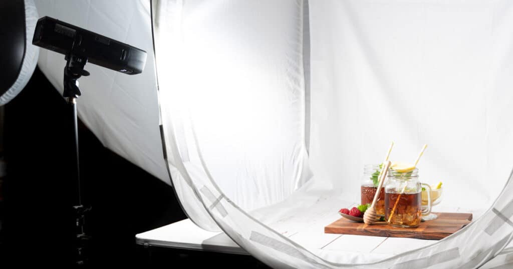
To choose the perfect background color for product photography, consider the image publishing purpose and platforms, take notes of product size, colors, shapes, uses, materials, and check how the lights interact. The right background color affects products’ clarity, viewers’ perception on product and the manufacturer, and their decision to create conversion.
Professional product photographers evaluate product features, materials, lighting, tone, and contrast, and decide on the background colors. The best background colors used for shooting products vary from white, single colored, multi-colored, shades, tones, paper, metal, glass, fabric, etc. When you need to cut costs but want to show products in different lighting, product photo background editing is a smart choice to get high-quality images, refine edges, preserve details, and standardize visuals as marketing materials.
How Do You Choose the Background Color for Product Photos?
To choose the right background color for product photos, consider the product’s features, such as color, size, shape, use cases, and other additional information, including models, photography lighting, and publishing platforms. Choosing the right backdrop is about psychologically convincing buyers to make a purchase and positioning brands in a way that aligns with that goal. Considering these factors would narrow down the choices of backdrop.
Here are the steps for how we generally choose the photography backdrops while shooting products.
Step 1: Think of the Product’s Final Destination
Visualize the end first, the end goal of the product images, whether they are to sell, inform, or elevate brand perception.
- To sell, select a neutral, minimalist design background to keep viewers focused. E-commerce platforms set rules on shooting product hero images on a white, gray, or black background, as they increase product clarity.
- To inform and create a value, use dark or moodier backdrops.
- To elevate brand perception by relating the product’s usage, allowing for contextual and lifestyle background.
Step 2: Prepare Your Setup for a Fusion
Product material: Use neutral backgrounds for glossy, metallic, or reflective surface products to prevent color casts and reflections. Use warm or rich tones for products made of matte, textured, or fabric.
Step 3: Set Your Lighting Equipment for the Right Interaction
Lighting holds a major role in the view of the camera frame. Positioning the light at the right angle will determine the professional look of the product. Experienced photographers thats why they pay attention to lighting behaviour. A backdrop’s color influences how light bounces back onto the product, affecting highlights, shadows, and color representation.
- Light backgrounds reflect light. It can soften shadows. You need to control it to avoid products’ flattened dimensional appearance.
- Dark backgrounds absorb light, so it demands stronger or more directional lighting.
Step 4: Follow Platform Standards for Background Colors
Amazon, Shopify, eBay, and Walmart product visuals are the top-notch to look for background color ideas. They already show the background that accentuates a product the best. You can follow those colors with deviation (such as a white check or pattern) to publish images on social media or company websites.
Step 5: Take Advantage of Color Psychology
Professional photographers prioritize emotional temperature instead of just relying on the color symbol. Product background should support the subject to change the viewers’ mindset and perspective.
- Use cool colors as a background when you aim for precision, a clean look, and a calm approach in photos.
- Use warm colors when comfort, handmade, personalized, or approachability is your priority.
- Use a muted tone for delivering the message of longevity and sophistication.
What are the Best Background Colors for Product Photos?
The best background colors for product photos are e-commerce background, colored backgrounds, tonal or shaded background, paper background, and metal background, among others. Choosing the right background elevates products’ features, looks, and buyers’ desire to purchase, which increases the brand’s engagement and sales.

01. E-commerce Background Colors
E-commerce background colors refer to white, black, gray, beige, and other secondary image colors (pastel neutrals, navy blue, etc.) Most marketplaces accept these colors for primary or secondary images due to products’ clarity, accurate color rendering, and brand preferences.
Why it works
- Maintains visual consistency across listings
- Builds buyer trust and conversion confidence
- Improves contrast and edge definition
- Supports accurate color perception
Best for: All e-commerce products, electronics, fashion, beauty, and household goods.
02. Colored Backgrounds
Colored backgrounds refer to single or multi-colored backgrounds that are used for creating mood and enhancing product appeal. Proper color choice improves contrast, complements textures, and guides the viewer’s eye toward the product. Monochrome setups maintain simplicity and elegance. Bold or gradient tones grab attention and highlight product features.
Why it works
- Adds emotional and psychological impact to visuals
- Enhances contrast with product colors for clarity
- Supports brand storytelling and marketing goals
Best for: Any products from fashion and apparel, cosmetics, jewelry, tech gadgets, lifestyle products, food photography, home décor, and all online platforms.
03. Tonal or Shade Background
Tones or shade backgrounds of different colors enhance product visibility by prioritizing textures and creating contrast. They maintain true color representation and guide viewers to the product under different materials and lighting setups.
Why it works
- Highlights the product without distractions
- Supports emotional appeal through color psychology
- Ensures visual consistency across platforms
Best for: E-commerce products, lifestyle shots, jewelry, electronics, apparel, accessories, food photography, home décor, and professional catalog imagery.
04. Paper Background
Paper backgrounds generate soft texture, neutrality, and flexibility in product photoshoots. Any type of craft paper, fine-art, or seamless paper, canvas, or drawing papers used as a background reduces reflections and allows precise lighting control. You can maintain accurate colors and clean edges in high-volume product shoots.
Why it works
- Ensures accurate color reproduction
- Easy lighting control for consistent exposure
- Simplifies masking and background cleanup in post-production
Best for: Jewelry, stationery, cosmetics, fashion accessories, handmade, and minimalist products
05. Metal Background
Metal backgrounds demonstrate power, strength, stability, durability, etc. for a product. Brushed or matte metal is commonly used for artistic and motive-directed photoshoots. It allows controlling reflections while adding an industrial or technical tone that enhances contrast.
Why it works
- Adds industrial or technical character
- Enhances contrast and edge definition under directional light
- Reinforces durability and premium manufacturing/build
Best for: Equipment and tools, electronics, automotive accessories, and industrial products.
06. Glass Background
Glass backgrounds or reflective backgrounds produce a clean, modern, and high-end look of product. If you use frosted or lightly diffused glass, it will avoid harsh glare while enhancing product separation, transparency, and premium perception through light interaction.
Why it works
- Creates controlled reflections that enhance depth and a premium look
- Supports transparent and reflective products without heavy texture
- Works well with diffused lighting for a modern, high-end look
Best for: Beauty products, fragrances, luxury packaging, modern tech items
07. Natural Objects Background
Sand, water, sky, mountain, trees, any part of nature you can use for your background color and elements of your product photoshoot. Those types of backgrounds have a versatility of colors that complements the product with freshness and reliability.
Why it works
- Add authenticity without heavy styling
- Helps control light spill, reduces glare, and enhances surface details
- Increase perceived trust and craftsmanship
Best for: Skincare, beverages, healthcare products, etc.
08. Solid Background
Solid background refers to those with hard surfaces such as concrete, stone, natural rock, marble, wood, etc. Such backgrounds provide an earthy vibe, depth, naturalism, and authenticity in the images, without overpowering the products.
Why it works
- Avoids harsh reflections
- Provides texture and color balances
- Prevent pattern dominance
Best for: Solid backgrounds work best for industrial products, footwear, lifestyle products, skincare products, perfumes, etc.
09. Fabric Textured Background
Fabric-based backgrounds refer to all types of clothing, such as muslin, satin, velvet, pattern, digitally printed, etc. Those are used for developing softness and realism into the frame without clutter. You can use subtle textures so that product edges or branding details show well.
Why it works
- Develops a soft diffusion
- Adds lifestyle realism
- Produces a non-reflective and comforting view
Best for: A fabric background is ideal for shooting apparel/clothing products, accessories, and handmade items.
10. Wood Background
Wooden backgrounds show the natural texture while maintaining structure. It creates a warm feeling among the viewers, assisting photographers to develop a storytelling concept with the products’ form or colors.
Why it works
- Creating an organic and authentic feeling
- Ensure visual stability
- Provides lifestyle context
- Establishes a warm contrast
Best for: Wood backgrounds are best for shooting kitchenware, home décor, and artisanal products.
11. Tile Surface Background
Tile backgrounds provide a structured and clean visual order without overpowering the product. This background supports product alignment by using lines while suggesting durability and a modern look.
Why it works
- Non-distracting texture
- Creates contextual realism
- Appears as a structured framing
Best for: Tile backgrounds work best for bathroom products, kitchen accessories, skincare, home improvement items, etc.
12. Charcoal Background
The charcoal background delivers a clean look without losing detail. It provides enough darkness for contrast, and the textures, edges, and highlights remain visible under controlled lighting.
Why it works
- Provides high contrast
- Retains the details of the product
- Display a premium look
- Allows lighting control
Best for: Charcoal background works fine for shooting luxury products, watches, and high-end accessories.
Why is Background Color so Important in Product Photography?
Background color is so important in product photography due to its influence on visual elements. Background controls how a product is perceived, emotionally interpreted, and trusted by potential buyers. The right background plays with psychology, brand positioning, and conversion behavior.
- Color controls viewers’ first impression, delivering information subconsciously.
- Color psychology navigates emotional responses to match products’ purposes.
- Background color impacts product clarity and focus through edge separation, accurate color rendering, and establishing visual hierarchy.
- Consistent color palettes create recognition and consistency for brands.
- Color impacts on buyers’ confidence in product purchase.
How Does Color Affect a Product?
Color affects a product by directly influencing the perception, understanding, and value, before the description. In professional product photography, color is used as a psychological and visual control tool. Choosing the right background colors for shooting products improves the clarity of the products, drives emotional response from the buyers, and builds trust around the brand. That’s why experienced product photographers always test color interaction under lighting before finalizing backgrounds for accurate demonstration on camera.
What Color Background is Best for Taking Product Images?
White is generally the best color background for taking product images. It makes the product clear, minimal, accurate, and compliant to look at. The best background color for product photography is the one that enhances contrast, supports lighting behavior, and accentuates products. Depending on product shape, photoshoot purposes,s and commercial platforms, you can choose any background.
- Dark backgrounds make the product premium.
- Mid-tone neutral backgrounds are best for dark and reflective products.
- Natural and elemental backgrounds fit well for healthcare and lifestyle products.
Why is Post-Production Editing Necessary in Background Work?
Post-production editing is necessary in the background work in order to avoid reshooting, adjusting color, material, or setting to create clean, high-quality, and professional images. Professionally editing makes the product trustworthy through images, engages potential buyers, contributing to companies’ engagement and conversion.
Other reasons why post-production is important in background editing are as follows
- To maintain a consistent product background
During a photoshoot, lighting, background shades, and tones might change and look different. To retain the uniformity, editing is essential, as you can adjust tone, colors, brightness, and accurate product appearance across catalogs, marketplaces, and social media.
- To prevent color casts from appearing on the final photo
Color casts caused by lighting and surroundings reflected in the images, which causes nuisance to the viewers. Professional photo editors take care of these issues and eliminate those unwanted color casts, so product colors stay accurate.
- To isolate the subject and define the edge
Backdrop editing helps restore the product’s appearance and shape by isolating it from the surroundings and creating perfect edges. To edit product photos in Photoshop, professionals use refined masking techniques to preserve fine details and accurate outlines, ensuring products appear sharp, clear, and commercially ready.
- To add multiple backgrounds for different usage
Shooting takes time and costs, but editing saves both. A single product shot requires a different background, for example, pure white for e-commerce, textured for branding, and vibrant for ads. Post-processing allows you to create images with creativity, in a personalized and brand-specific way, also following e-commerce platforms.
- To remove distractions
Dust, creases, uneven textures, tile seams, or surface flaws look obvious in high-resolution images. Editing eliminates these distractions while keeping the background natural and believable.
FAQ’s
What background color works best for product photography and sales?
White background color works best for product photography and sales due to e-commerce priority, minimalist look, and product clarity. White and other light-colored backgrounds consistently perform best for reducing distractions. Other backgrounds, such as dark, neutral, and contextual backgrounds, are also in demand for shooting products.
Why do you need a white background for product photography?
A white background maintains product consistency across SKUs, platforms, and viewers with a clean look. This approach builds trust, ensures accurate color representation, simplifies editing, and keeps viewers focused on the products.
What color should I pick if my product is dark or black?
To shoot a dark or black product, you should pick a color that highlights the product and uplifts its benefits. Choose colors opposite to the product color, or something mid-tone gray, slate, beige, textured neutrals, etc. They will separate the product edge, reveal shape, and prevent detail loss, preserving the high-quality look of the product.
Do I need to shoot multiple background versions for one product?
Yes, you need to shoot multiple background versions for one product for mainly 2 reasons: to identify which background displays the product the best, and to make the images available to use on different sales channels, such as websites, ads, social media, e-commerce platforms, etc.
