
The difference between color correction and color grading is the intended sector of use. Color correction is the initial level of image processing, whereas color grading comes as one of the finishing steps of the editing process.
Color correction rectifies image color flaws caused due to light, incorrect angle, or technical imbalances. By using color correction, professional photo editors ensure consistent and professional images. Color correction is used in photography, e-commerce, fashion and advertising, and marketing industries.
Color Grading comes after color correction, and it is the process of artistic and creative application of color to create a certain mood or style in a photo. It is used in advertising, entertainment, AR & VR industries, along with online streaming platforms.
Both color correction and color grading are complicated processes, and collaborating with professional color correction services benefits the industry with high-quality, consistent, professional, and stunning photos to fulfill marketing purposes and impress viewers.
What is Color Correction in Photo Editing?
Color correcting in photo editing is the process of rendering colors in a photo to look natural to the human eye. It is a fundamental image post-production technique that ensures removing color issues and fixing colors for professional and eye-catching standard images.
Different lighting conditions create color differences in photos. Lights for photography influence color temperature; warm light has a yellow glow, and cool light produces a blue hue in your photos. Commercial grade photography needs a color consistent look that retains quality and visual dominance. Image color correction adjusts colors to make photos natural to the human eye.
When Would You Need Color Correction in Photo Editing?
You would need color correction in photo editing to neutralize images to uniformity and consistency between human eyes and the camera lens. Cameras record a single image on the sensor in a split second. When the scene contains more than one color temperature illuminating a scene, it cannot correct the colors. Image editing, color correction, rectifies color imbalance, and perfects the photos. The necessity of color correction has spread across different industries, such as professional photography, the fashion industry, the e-commerce industry, and the advertising and marketing industry.
1. Photography Industry
The photography industry heavily relies on color correction. It creates natural, true-to-life images taken in different lighting conditions and camera settings. Photographs come with color differences and color imbalances. Photographers use color correction to solve issues of color casts, white balance, and different presentation of colors, making the photos visually appealing and realistic. As a result, color correction maintains consistency across a photo series or portfolio.
2. E-commerce Industry
In the e-commerce industry, color correction offers a consistent, professional, and brand-specific product look. It helps customers make informed purchasing decisions, impacts their confidence, and reduces returns caused by color discrepancies. Professional photo editors use color correction to maintain visual consistency across product images, align with brand color palettes, and boost engagement on product listings.
3. Fashion Industry
In fashion photography, color correction accurately represents apparel photographs, jewelry photographs, shoe photographs, perfume photographs, and products that are connected and related to fashion. Authentic representation of products influences buyers’ purchasing decisions, maintains brand identity, and customer loyalty. Fashion brands collaborate with photo editing companies for professional color correction to ensure that the colors of products appear consistent across lookbooks, catalogs, and online shops.
4. Advertising and Marketing Industry
In advertising and marketing, color correction is used for meeting visuals and technical standards and delivering the intended message to the targeted audience. By correcting, advertising agencies maintain brand consistency and successful marketing campaigns. Color correction aligns with the brand’s commercials’ look by merging cultural references, cinematic styles, and ongoing trends to resonate with the target audience, enhancing the campaign’s impact.
How Does Color Correction Impact the Overall Quality of a Photo?
Color correction impacts the overall quality of a photo by achieving natural, precise, and true-to-life colors. It makes a significant boost to image quality by transforming dull, flat, and flawed images into vibrant, realistic, and visually impactful ones. It benefits the commercial contexts through maintaining brand consistency across a series of images to be published on different advertising platforms.
To create images that resemble real life, color correction considers 2 factors.
- The subject appears similar to the human world
- The subject’s size, color, and situation are proportionate to human eyes
The process contains a series of adjustments, including fixing white balance, contrast, exposure, saturation, resolving color casts, and color imbalance. Photo editors make necessary changes to bring a natural, authentic, and visually appealing look to photos. To improve image quality, photo editors perform the following editing process in color correction.
- White balance: Accurate use of white balance eliminates the appearance of color casts, for example yellow glow in photos due to incandescent lights or a bluish vibe from fluorescent lights.
- Hue, Saturation, and Lightness: Hue, Saturation, and Lightness, or HSL, is used for specific uplift of selective colors to selective adjustments. Upgrading certain parts of images maintains the purpose of the images, drawing viewers’ attention where it should be.
- Contrast: Contrast is used for escalating the difference between lightness and darkness. Creating a dynamic atmosphere in the image.
- Exposure and levels: Editing levels and exposure accentuate the details that highlights and shadows contain to make photos visibly rich.
How to Color Correct Your Images?
To color-correct your photos properly, you must know what the colors in the photo look like. You must also understand how to use the color correction tools in the editing software. Across many popular editing programs, these tools are very much the same, and so is the process.
Here is the base image to demonstrate. This photo was saved as a RAW file on my camera. I have opened it and saved it as a .jpg without manipulating it.

The first step in my color correction process was to adjust the exposure because the photo is a little too dark. Then I tweaked the highlights so that they are a little brighter. Next, I adjusted the shadow slightly and darkened the blacks. I made no changes to the mid-tones because, after adjusting the exposure, these colors looked good.

Once I’d made these changes, I thought the colors still looked a little dull. I then adjusted the saturation and vibrance to boost the colors a bit more.
This photo was taken using daylight, and my camera’s white balance setting was set to automatic. So there was no need for me to adjust the color temperature.
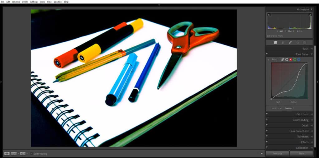
Below is the color-corrected image with all the changes applied.

The white page of the sketch pad looks clean and white. The blacks are deep and rich, containing no color cast. The colors of the art products look natural as they do to my eye.
Color Correction Before and After
Placing the original beside the color-corrected photo, you can see the differences.
The overall tone of the edited photo is much more lively and realistic than the muted tones of the RAW file.
What is Color Grading in Photo Editing?
Color grading in photo editing is the creative and intentional process of manipulating colors to make them artistic, surreal, hyper-realistic, to adjust and achieve a specific mood, style, or art.
Color grading establishes an artistic ambience, mood, and atmosphere to develop a story or uphold a certain concept of the photographer. This technique is most effective when the same color grading process is applied to a series of similar photographs.
Professional photo editors use color grading by altering the hue of shadows in a photo with a different tone than the highlights. One popular choice for color grading editors is to add teal to the shadows and yellow or orange to the highlights in a photo.
When Would You Need Color Grading in Photo Editing?
You would need color grading in photo editing to create a specific mood and style for artistic expression and drive the viewer’s emotions. Color grading affects in formulation cohesive and evocative vibe in images, often required for editing custom and unified images. The needs of color grading across different industries are as follows.
1. Advertising Industry
Advertising agencies benefit from color grading as the process makes interesting and memorable visuals, reinforcing brand identity. Grading technique enhances product appeal, creating an eye-catching appearance through elegant color palettes. It is used in commercials, promotional videos, and ad campaign imagery to preserve brand consistency, professionalism, and mood alignment with marketing goals.
2. Entertainment Industry
The entertainment industry is dependent on color grading for establishing brand uniqueness through tone and visuals of their products—movies/films, TV shows, music videos, and animation. Grading unifies footage shot under varying lighting conditions and creates a cohesive storytelling to spark the viewer’s interest and evoke emotions. Warm tones translate to nostalgic scenes, or cool tones for intensity or suspense. Color grading differentiates characters, time, or locations, making the narrative compelling for viewers.
3. AR and VR Industry
The AR (Augmented Reality) and VR (Virtual Reality) industry highly relies on professional color grading to create immersive and interactive environments. It adjusts colors to match the desired ambience and mimic realism or authenticity. Effective use of color grading increases user engagement and satisfaction for the AR/VR industry. It also maintains visual cohesion across virtual environments, making users’ experience seamless.
4. Online Streaming Platforms
Streaming platforms rely on color grading for a consistent visual style across different devices and diverse content. Professional use of grading ensures a high-quality viewing experience. It also creates a cinematic mood, making the content engaging and appealing and preserving artistic intent for audience retention.
How Does Color Grading Impact the Overall Quality of a Photo?
Color grading impacts the overall quality of a photo by creating a specific mood, style, or artistic effect. It makes the images thoughtful, visually striking, and cohesive, so that it delivers a message or tells a story.
Photographers and photo editors use color grading to create artistic expression and guide viewers’ emotions. A well-graded image exudes a unique mood and style, leaving a lasting impression about the artistry of the work. In photography post-production, the color grading process involves different changes to enhance the image as follows.
- Curves, color wheels, and wplit toning: It offers precise control over shadows, midtones, and highlights for a specific color effect.
- Hue, saturation, brightness, and contrast: These changes make photos vibrant, vivid, and improve tonal balance.
- Highlights and shadows: It is used for crafting a specific atmosphere or visual style to evoke emotion.
- Selective enhancing or muting certain colors: It guides the viewer’s attention and supports the brand’s story.
How to Color Grade Your Images?
Color correction focuses on tweaking the exposure, white balance, and tones in a photo. Color grading focuses more on the:
- Hue
- Levels
- Curves
- Solid color filling
- Split toning
- And saturation
All or only some of these controls may be used to color grade photos to achieve the look and feel you are aiming for.
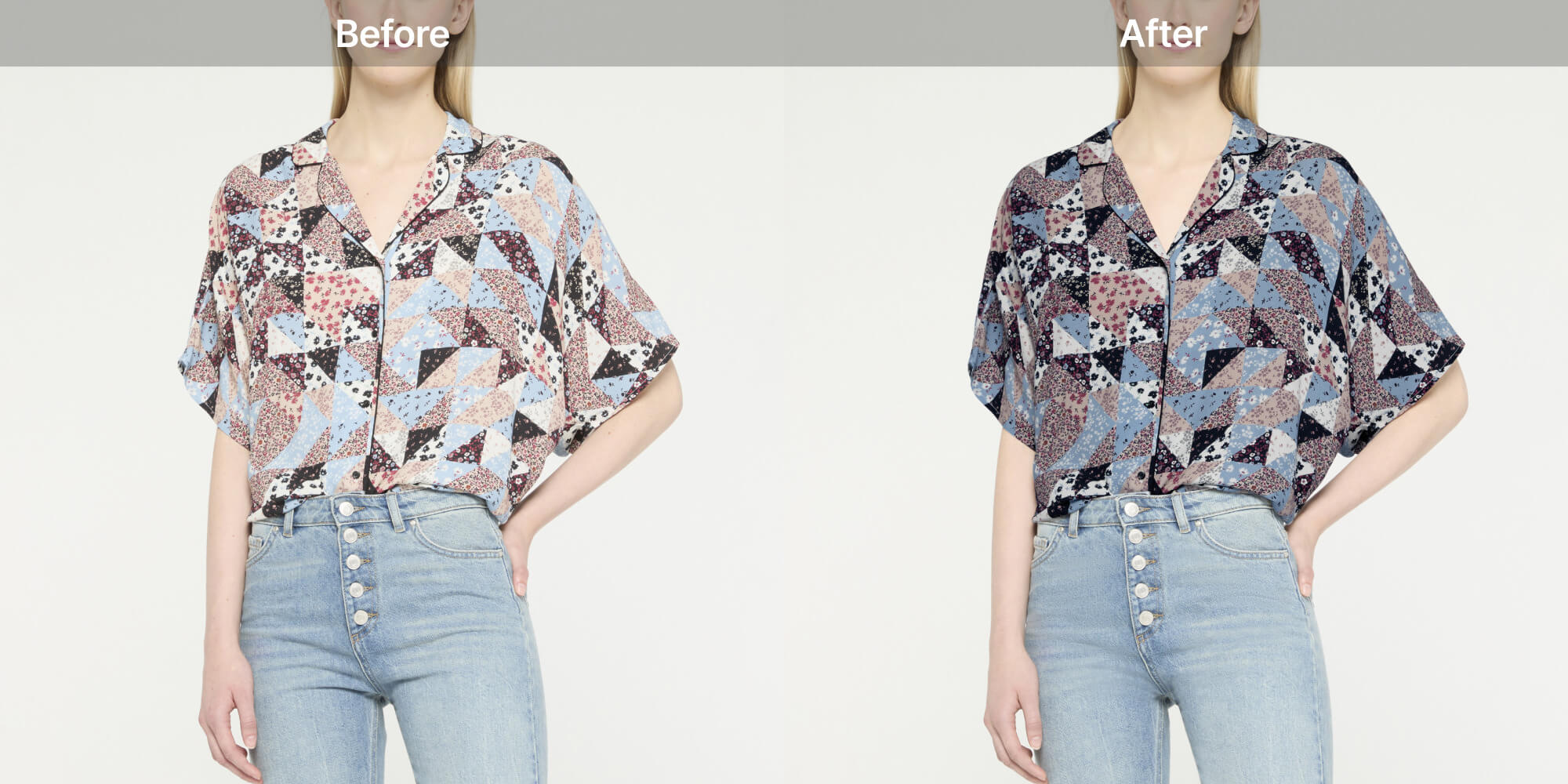
In this image, I have manipulated the main colors of the products so they look similar. The warm colors were tweaked to appear more orange, and the cool colors had a teal tone.

For this image, I adjusted the contrast, highlights, and the saturation levels. I also tweaked the white balance.
By pushing the contrast higher and increasing the saturation, the colors appear more bold than they naturally do. I dragged the white balance slider more toward the blue end of the spectrum. Notice the effect this has, particularly on the shadow of the blue marker pen.

You will also notice the blue cast on the white paper created by the shadow of the yellow marker pen. This is not a natural occurrence. It happened because of the combination of other changes I made when editing this photo.
Whenever you are manipulating color grading sliders in editing software, you must check the effects that are in real-time. As you make the changes, check each area and color in the image to ensure the photo ends up looking as you intend it to.
For this last image, I added some curve adjustments and used the color grading panel in Lightroom to give the photo a cross-processed look. This produces a vintage look with unusual coloring.
Color Grading Before and After
Comparing the original RAW image with any of the color-graded ones, it is easy to see the differences.

This look was originally produced when processing a film with incorrect chemicals. It involved developing a negative film in chemicals for processing positive films and vice versa.
The real key to being successful with color grading is your intent. When you have a clear idea in mind of the look and feel you want, the process is more straightforward.
Having only a vague impression of what you want means the process is less precise, and a series of images may not look as cohesive as they might.
Learning to translate what you envisage into the final edited photos takes training and skill. You must know what you want before you begin the process for real.
As you are learning the art of color grading, don’t be afraid to experiment. A lot! The more time you spend practicing, you’ll come to know the broad variety of effects the different tools have.
Try adding the same treatment to different photos and compare them.
What is the Difference Between Color Correction and Color Grading in Photo Editing?
The difference between color correction and color grading in photo editing is the purpose. Color correction in images creates a precise and authentic appearance, similar to real life, whereas color grading makes images appear surreal and creative to contribute to a specific mood or style. Other differences of color grading vs color correction are as follows.
1. Purpose
Photo editors use color correction to fix and adjust color imbalances, flaws to attain balanced and accurate-looking photos similar to the human world. The process also focuses on solving technical issues, such as color casts, exposure, white balance, etc. When it comes to color grading, it is the artistic and creative process of styling and enhancing photos to set specific tones, moods, or artistic effects. The process manipulates colors to evoke emotions and develop a unique visual style.
2. Technical Method
The color correction method applies color flaws, color imbalance, exposure, white balance, lighting issues, saturation, and contrast to standardize the images. For the color grading method, the changes include the color’s hue, midtones, highlights, and shadows to create an artistic appearance.
3. Position in Workflow
While editing starts, color correction is performed early. It is a foundational step to ensure all images contain natural colors with a consistent appearance. Contrary to color correction, color grading is performed as the final and finishing step to implement creative colors for the desired output or stylish impact.
4. Used Tools for Editing
To apply the color correction process, photo editing tools offer levels, white balance controls, curves, and basic color balance adjustments. To apply advanced-level color grading, image editing software offers color wheels, LUTs, color curves, and specialized grading software or suites.
5. Applied Adjustments
The adjustments of color correction include black and white levels, brightness, contrast, and saturation to fix color inconsistencies. The adjustments of color grading include selective and artistic use of color, such as shifting specific color hues, tones, highlights, shadows, and applying color effects to support storytelling or evoke emotion.
6. Complexity Level
Color correction is a straightforward and technical process, mostly follows precise and traditional methods to restore natural color fidelity. Color grading is a complicated and artistic process. There is no fixed rule for applying creativity, it requires experimentation and understanding of color to achieve a perfect color balance.
7. Artistic Freedom
Color correction has limitations in artistic applications. It relies on creating accurate and realistic appearances, avoiding unnatural color shifts. Color grading allows ample space for applying art, creativity, color manipulation, and deviations from natural colors.
8. Required Time for Processing
When compared, color correction takes relatively less time than color grading. Color grading is time-consuming because the process relies on creativity and artistic expression in the photo.
9. Use Cases
Color correction is used in companies and industries where image color accuracy and consistency are prime factors. Examples of color correction are commercial photography, e-commerce product photography, fashion photos, etc. Color grading is essential to create a specific mood, evoke emotion, and develop storytelling. Examples of color grading include ad campaigns by agencies, the entertainment industry, and anime banners, posters, etc.
Difference Table Color Correction vs Color Grading in Photo Editing:
| Criteria | Color Correction | Color Grading |
|---|---|---|
| Purpose | Used for attaining a neutral, balanced, and realistic appearance similar to human eyes. | Used for nurturing a distinctive visual style or atmosphere to attract human eyes. |
| Method | Rectify color flaws, imbalance, and stick to earthy looks. | Borrowing and using colors not related to create an artistic and creative look. |
| Position in Workflow | Early steps of editing. | Performed after photo color correction as a final step. |
| Editing Tool | Levels, curves, color balance. | Color wheels, LUTs (Look-Up Tables), color curves. |
| Adjustments | The process includes adjusting white balance, contrast, exposure, saturation, and removing color casts and flaws to achieve a natural and accurate appearance. | The process involves manipulating hues, tones, highlights, shadows, and applying color effects to stylize photos, evoke emotions, or support storytelling. |
| Complexity Level | Involves selective, straightforward fixing and adjusting colors to restore naturalism. | Incorporates creative expression and aesthetic balance of concept clarification. |
| Artistic Freedom | Less chance of creating art, more prone to fulfilling traditional needs. | Opt for creating art as necessary to attract and convince through visuals. |
| Time | Less than color grading. | More than color correction. |
| Use Cases | E-commerce product photography, fashion photos, etc. | Advertising agencies’ campaigns, movies, or anime posters, etc. |
How to Improve Color Correction and Color Grading in Photo Editing?
To improve color correction and color grading in photo editing, rely on professional photo editors. Professional photo editors follow a precise process, use histograms and waveforms to identify color imbalances and color cast issues. By using photo masking and image layers, they adjust technical and visual issues that affect images. Understanding of color, curves, and levels HSL makes their color correction expertise reliable. When applying the color grading, professional editors apply artistic creativity to the process. They manipulate colors to create an artistic mood, which supports storytelling.
Where to Outsource Color Correction and Color Grading Service?
There are 2 ways to outsource color correction and color grading services: freelancing platforms and a professional photo color correction agency.
- Freelancing platforms offer a wide range of skilled photo editors with flexibility. You can hire from them according to your budget and requirements. However, some risks involve people’s fraudulent attempts.
- Professional photo color correction service companies offer consistent, high-quality services. They are backed by experienced teams and a standard workflow to meet urgent and bulk projects of the clients. You can rest assured of quality control, dedicated and precise work within your budget and timeline. Such companies ensure project uniformity and brand consistency, meeting clients’ demands all around the world.
FAQs
What comes first color grading or color correction?
It is most important to color-correct your photos before you apply any color grading to them. Once a photo is well-balanced and color corrected, any color grading adjustments are more consistent when applied to a series of photos.
What colors to use for color correcting?
Colors to use for color correcting are the opposite colors of the color wheel. Check what color effect the photo has and apply the opposite one. For example, use green to counterbalance the red effect, use yellow to hide the bluish effect, and use purple to neutralize yellow.
Does color correction come before or after other photo editing steps?
Color correction is the initial step of photo editing that fixes color imbalance and color cast, improves color appearance, and professional look. It comes before applying color grading.
Is color grading the same as split toning?
Split toning is one style of color grading that is very popular. But there’s more you can do with color grading than only using split toning.
Is color grading necessary after color correction in photo editing?
Color grading is necessary after color correction in photo editing to ensure a polished, refined, and artistic look. Though it’s not a mandatory step, using grading in photos enhances visual mood and style, adds a professional and cohesive touch, and enhances storytelling.
Can color grading fix exposure or white balance issues like color correction does?
Color grading can not fix exposure or white balance issues like color correction. Grading is used to augment visual dominance, attractiveness, and creativity. Color correction is the base, used for fixing unwanted issues and preparing the images for color grading.
What are the common tools used for color grading in photography?
The common tools used for color grading in photography are Adobe Photoshop, Adobe Lightroom, Skylum Luminar Neo, Capture One, etc.
Final Overview
- Color correction is used for neutralizing photos and maintaining uniformity. The process includes adjusting white balance, exposure, contrast, hue, saturation, lightness, etc.
- Color grading is used for creating an artistic mood or style. The process includes manipulating hue, saturation, brightness, using curves, color wheels, warmth, coolness, shadows, etc.
- Color correction fixes colors and makes a base for color grading. Color grading photos to attract viewers with thoughtful scenes.
- Color correction follows traditional ways instead of applying creativity, so the process takes less time than grading. Color grading is the innovative use of colors to create artistic scenes, which takes time.
- To improve color standards and get a faster output, outsourcing from professional color correction is the best solution considering time, resources, cost, and expertise.
