
Color is an essential feature of any object. In photography, color is described in terms of hue, lightness, and saturation. Understanding color includes terms, color wheels, color models, and color harmony, among the umbrella term color.
Color terms are the ideas, concepts, and words that clarify colors and related topics. It includes everything from hue, saturation, value, and temperature to color wheel, models, and harmony. The Color Wheel is a circle that displays the connection of colors on 3 different levels: primary, secondary, and tertiary. Color models are numerical or mathematical descriptions of colors. Color harmony is the combination of colors.
Colors impact photography immensely by conveying mood, accentuating a subject, and delivering the right message. Using photo editing software, users can create natural, consistent, and creative color combinations during the photography post-production.
What is Color in Photography?
Color is the visual representation of an object under different wavelengths of light. A color arises when light or electromagnetic radiation within a specific range of wavelengths interacts with an object and its interaction with the eye and brain.
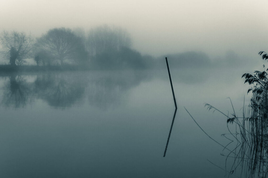
Color itself is not an inherent property of an object. Objects either reflect or emit light. We only see the wavelengths of that light that influence the colors. Interestingly, when an object reflects light, we see only the wavelengths that the object does not absorb. A blue object has absorbed all other colors except blue. Accurate color representation creates visual contrast, evokes viewers’ emotions, and enhances storytelling in an image.
Understanding Color in Photography
Understanding colors in photography refers to understanding color theory, which covers color terms, the color wheel, color models, and color harmony.
1. Understanding Color Terms in Photography
Color terms are the words and concepts that revolve around color to discuss, describe, and clarify color theory. Popular color terms extend to a broader range, including hue, saturation, luminosity, and temperature.
When working in photo editing software such as Lightroom or Photoshop, colors tend to have 3 main elements that we can alter: hue, saturation, and luminance (sometimes abbreviated to HSL). Luminance may also be known as brightness (so, HSB). A pure black-to-white grayscale shares luminance.
White is the brightest end, and black is the lowest luminance/brightness. For each color, we can leave the hue and saturation constant while changing the luminance value. At the same time, darker colors can sometimes appear more saturated than very bright ones.
Hue (Pure Color)
Hue refers to the color that is basic, dominant, and pure to human eyes, without any tint or shade. It is the name of the color, and one hue differs from another in the color family. In the tone of the color, it is closest to home on the color wheel. It is the wavelength of light that is most dominant, affecting how we see the “color” in electromagnetic radiation.
Hue sliders are powerful color control tools in both Lightroom and Photoshop. The software’s color blend mode affects the hue. When we speak about changing the color of a cloth in post-production, it refers to the hue.
Saturation
Saturation refers to the relative intensity and purity of a color. Saturation level affects the mood and composition of a photo.
- High saturation creates a vivid and bright color.
- Low saturation creates a diluted or muted look.
Luminosity
Luminosity stands for the perception of color’s lightness level, how bright or dark the color is.
- Colors with high luminosity contain more light and appear brighter.
- Colors having low luminosity appear dark because they contain less light.
How Does Saturation and Luminosity Affect Color Perception? Luminosity and saturation affect color perception by the amount of white or black the color contains. Adding white to the base color will increase luminosity and decrease saturation, resulting in a lighter appearance of color. Adding black to the base color will decrease luminosity and increase saturation, so the color will appear darker.
Value
Value is the lightness or darkness of a color. It is measured from lightest to darkest (white to black) with different shades of gray in between.
Temperature
Temperature is the scale of measuring a color’s coolness or warmth. It affects the perception and mood of a color.
- Cool colors appear more towards blue: Blue, green, violet
- Warm colors appear more towards orange: Red, orange, yellow
Color Calibration
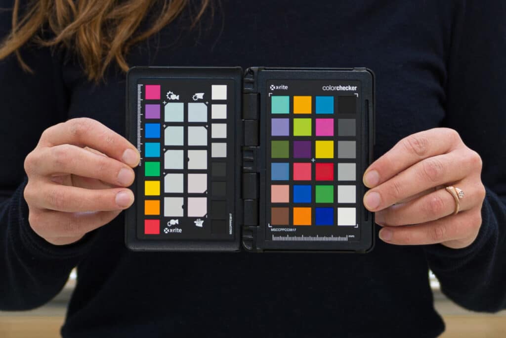
Color Calibration is the process of accurate color representation across all devices. There are various tools available to enable you to calibrate your workflow. Most photographers need 2 tools.
- A color chart with color-checking software: A color chart with color-checking software is much better than just a grey card. Using an 18% grey reference can be useful for exposure and overall white balance, but it is not as accurate across a range of colors as a chart. You can get a range of sizes of charts depending on what you are photographing. The important thing is to get a photo with the whole chart in the frame under the same lighting conditions as you are about to take your photos. When you run the chart through the software, you will get an accurate calibration preset that you can apply to everything shot in those conditions.
- A monitor calibration device: The monitor or display you use needs to be calibrated with a tool to ensure it keeps the colors as close to the standard benchmark as possible. This normally hangs in front of the monitor so that it can see the tests running on screen from the software. It should then offer you a color-corrected profile that you can select to run automatically on your device.
You can get equipment to calibrate printers. To use a print laboratory to do your prints, you just need to get a copy of their print profile for each paper type you want to use. Then, you can use that profile for soft proofing in Photoshop. Printer calibration checks that the output colors are as expected.
Keep an eye out for deviation – screens emit light, whereas objects and prints reflect light. So, they will never look completely identical. The situation in which you view an object or a print can influence how you perceive the colors as well. This is particularly obvious when viewing under lights that have a different white balance.
Tint (Hue + White)
Tint is the lighter version of a hue, which is achieved by adding white and lightness. Tint increases a color’s reflectivity; for example, pink is a tint of red.
Tone (Hue + Gray)
Tone is the muted version of hue formed by adding gray to the hue; for example, dusty rose is a tone of red. Depending on the amount of gray, the tone appearance can be lighter or darker and reduce saturation.
Shade (Hue + Black)
Shade is a darker version of the hue created by adding black and darkness to it. It decreases the color’s lightness, such as maroon, which is a shade of red.
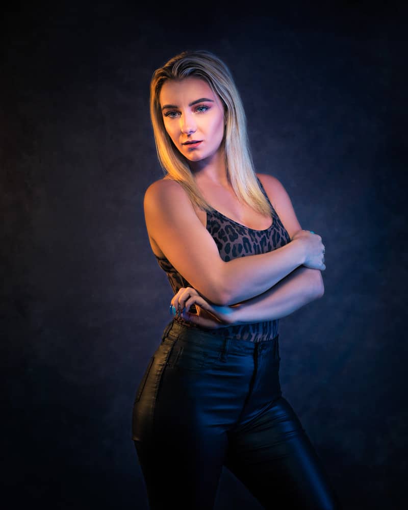
White Balance
White Balance in color is the process of making white appear white. It is all about noticing the effect of the light source on our perception of colors.
An object under an orange light will look different under a blue light. The whites or grayscale tones will appear more orange or blue, according to the light falling on and reflecting off them. Use Automatic white balance functions and measure with a grey card to neutralize the effects of ambient light to true and neutral conditions.
- When an orange vibe appears in images, set the white balance to account for a warmer light source to make them look white instead.
- When the blue vibe appears in photos, achieve a more neutral white by altering the white balance either in-camera or later in the photo editing software.
- To neutralize the appearance of green color cast, use gray cards and color charts (with software) that give us a benchmark for standardizing color.
Understanding how this works and affects our images means that we can also deliberately add in color casts for creative effect—this is essentially what certain types of color grading do for video and images.
2. Understanding the Color Wheel
A color wheel is a circular diagram that shows the relationship among colors. In 1704, Sir Isaac Newton first coined the term color wheel in his book Optics. The color wheel is used to create color schemes.
Primary Colors
Primary colors refer to the fundamental colors that are mixed to create other colors. Primary colors serve as parents for other colors in the color wheel. There 3 primary color models globally used.
- RYB Model: Red, yellow, and blue colors. It is used in art and painting.
- RGB Model: Red, green, and blue colors. It is used in digital displays.
- CMYK: Cyan, magenta, yellow, and black. It is used for printing.
Secondary Colors
Secondary colors appear after mixing two primary colors. They are placed between 2 primary colors. There are 3 secondary colors in the color wheel: orange, purple, and green.
- Yellow + Red: Orange
- Red + Blue: Purple
- Blue + Yellow: Green
Tertiary Colors
Tertiary colors are the colors that are formed by combining one primary and one secondary color. They are positioned between primary and secondary colors. There are 6 tertiary colors in the color wheel: vermilion, amber, magenta, chartreuse, violet, and teal.
- Red + orange: Vermillion
- Yellow + Orange: Amber
- Red + Purple: Magenta
- Yellow + Green: Chartreuse
- Blue + Purple: Violet
- Blue + green: Teal
3. Understanding Different Color Models
A color model is a mathematical or numerical description of color. There are 2 main categories of color models.
- Additive Color Model: Creates colors by adding different wavelengths of light, for example, RGB.
- Subtractive Color Model: Creates colors by subtracting certain wavelengths of light, for example, CMYK.
Some other color models are as follows.
| Color Models | Expansion | Purpose |
|---|---|---|
| HSV Color Model | Hue, saturation, and value. | Used for precise color selection and photo manipulation in photo editing software. |
| HSB Color Model | Hue, saturation, and brightness. | |
| Lab Color Model | L-lightness, a-green-red axis, b-blue and yellow axis. | Used for precise color correction and is consistent on different devices. |
| YUV Color Model | Y-luminance, u & v-chrominance components represent color differences. | Mainly used for video and broadcasting. |
| YIQ Color Models | Y-luminance, i & q-chrominance components optimized for human eye sensitivity in the NTSC television broadcasting system. |
What is the Connection Between Color Space and Color Models?
The connection between color models and color space is that a color model is the conceptual system, whereas color space is the device or standard realization of that system. Both color space and color model are often used interchangeably. Color models describe how colors can be represented in a mathematical or numerical way (RGB, CMYK, etc). Color space is a specific use of a color model.
4. Understanding Color Harmony Groups
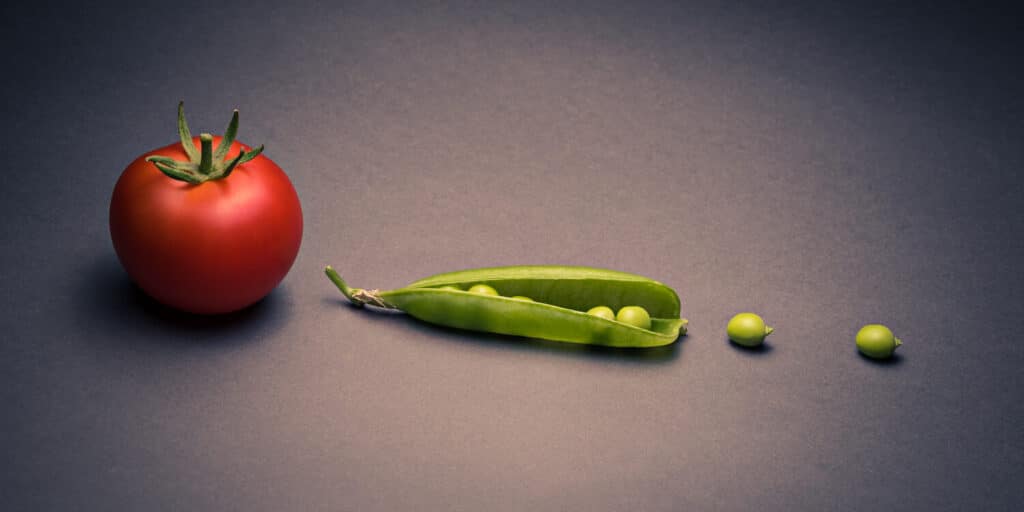
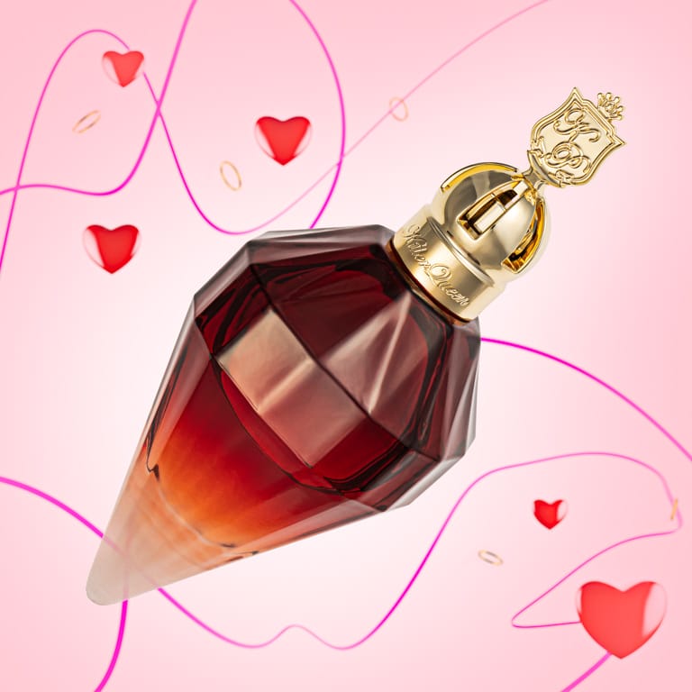
Color harmony is the combination of colors that creates a visually pleasing composition in a balanced way. The color harmony group is simple to create. I have taken a sample color from our subject to create a soft gradient color in the background, uniting the subject and the background effectively. We can use the color wheel to find all sorts of patterns that people use for good effects in art, design, and photography.
There are several color harmony groups, including the following ones.
Analogous
Analogous colors are a group of 3 colors that have a common hue and are adjacent to each other on the color wheel, such as yellow-green, yellow, and yellow-orange. Analogous colors create harmony as they are closely related.
Monochromatic
Monochromatic colors are the variation of a single hue, including tint, shades, and tones such as sky blue, blue, and navy blue. It is displayed in lighter and darker versions, representing the amount of black and white in that single hue.
Complimentary
Complementary colors are the pair of colors that neutralize each other to provide high contrast, such as red and green. In the color wheel, they sit opposite each other.
Split Complementary
Split complementary colors refer to the colors left and right of the complementary colors. It is used to balance contrasting complementary colors and the harmony of analogous colors. Examples of split complementary colors are yellow, orange, and red-orange for blue.
Compound
Compound colors are the mix of 3 primary colors with a different split complementary, which uses colors on both sides of the same hue. Examples of compound color schemes are brown, khaki, and yellow ochre.
Triadic
Triadic colors are the mixture of 3 colors that are evenly positioned on the color wheel, such as red, blue, and yellow. Triadic colors create a vibrant and balanced effect.
Square (Tetradic)
Tetradic/square color harmony is a combination of 4 colors evenly spaced around and offers complex and dynamic color schemes. Examples of square color harmony are green, blue, red, and yellow.
Adobe Color is a very useful resource for playing around with color harmonies. You can pick what sort of harmony you want and select a starting color. It then shows you the colors that would go with it for that form of harmony.
- Complementary colors are a well-known form of harmony using a pair of colors. You can find the complementary color by looking at the opposite color on the wheel, e.g., red and green, cyan and orange, etc.
- For a triadic harmony, click on a color, and it will then show the other 2 colors. Drag the colors out to the outer edge of the wheel (more saturated) to see the results.
If you use the “Extract Theme” function in Adobe Color and drop in an image, you get a quick analysis of the main tones in that image. This is very helpful for analyzing images to see what others have done and also for finding a set of colors to focus on if you want a coherent series. The palettes you create or find in the libraries can be brought into Photoshop or design software to help guide your color schemes.
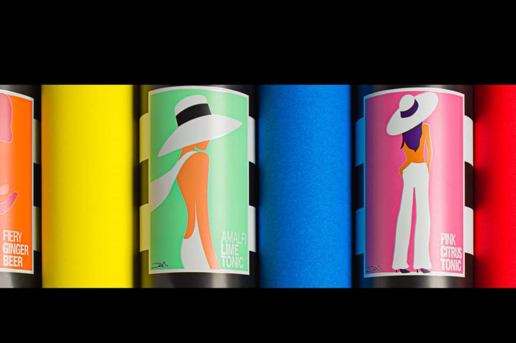
Colors, individually or merged, influence the mood. An analogous scheme gives a more balanced and restful feel to an image. Vibrant colors can give a more dynamic feel. Merging 2 or 3 hues can make the emotional contribution of those colors stronger than if they were to sit in a rainbow sea of varying tones.

How Do Colors Affect Photography?
Colors affect photography by emphasizing the subject in the photo, impacting the viewer’s mood and emotion, and delivering the message the photos intend.
Every color evokes a different emotional response in people. Professional photographers are adept with colors’ influence. Depending on the clients’ industry and their requirements, they apply color creatively.
When photographers deal with clients from the e-commerce industry, they pay attention to how colors impact potential consumers’ buying intentions and purchasing decisions. Warm colors evoke urgency, whereas cool colors convey trust. Strategic use of color improves conversion rates for brands. Choosing the colors should be aligned with the brand, target demographic, and industry of the clients.
Colors highly impact the photos of advertising agencies. Ads using color attract the attention of the viewers beyond the target audience. Using correct colors creates emotional cues, emphasizes delivering the right message and key information, and creates a positive first impression.
In the fashion industry, colors influence viewers’ mindsets and moods. Color trends and cultural understanding assist in fashion choices and enhance fashion brands’ marketing approaches.
How to Change Colors in Photos After Photography?
There is only one way to change colors in photos after photography – using photo editing software. Popular photo editing software to change colors is Adobe Photoshop, Adobe Lightroom, Skylum Luminar Neo, PaintShop Pro, and DxO PhotoLab. This software offers plenty of features with AI-powered solutions to change colors.
| Software | Offered Features for Changing Colors |
|---|---|
| Adobe Photoshop | Levels/Curves, Vibrance/Saturation, Exposure, Filters, Color Balance, and Hue/Saturation |
| Adobe Lightroom | Color Mix Panel, White Balance, HSL/Color Sliders, Tone Curve, Vibrance/Saturation |
| Skylum Luminar Neo | Manual Color Controls, HSL Panel, Color Harmony |
| PaintShop Pro | Hue/Saturation/Lightness Adjustments, Selective Color, Color Replacement |
| DxO PhotoLab | Tone Curve, Exposure/Contrast/Microcontrast, White Balance, ColorWheel, HSL Adjustments, LUTs |
You can either do the color-changing work manually or outsource from a professional image color correction service for consistent, high-quality, and professional-looking images.
Why is Color Correction Used in the Post-Production Process?
Color correction is used in the post-production process to ensure a natural, consistent, high-quality image appearance that attracts viewers and eliminates confusion. When correcting large batches of image files is time-consuming, image accuracy is pivotal; getting a color-managed workflow is the best solution. Other reasons for using color correction in the post-production process are as follows.
- Addressing technical issues
Color correction addresses inconsistencies such as uneven lighting, unnatural color casts, inaccurate white balance, and inconsistent exposure levels (under-exposed or overexposed) that arise during shooting conditions, equipment, or lighting imbalances. It matches footage from different cameras, locations, or times of day to create a cohesive look throughout the photography.
- Maintaining accuracy and consistency
Color correction is a standard practice in film, television, and digital media production and effectively creates high-quality visuals. Professionals use editing software to adjust the color, contrast, and exposure of images or film footage. Color correction is all about matching the way the human eye sees it.
- Optimizing for Visual Effects (VFX)
Color correction photo editing technique ensures that any added visual effects blend seamlessly with the footage and maintain a natural appearance. With color correction, you can provide a clean and balanced base for the color grading process, which involves more artistic product visuals.
- Establish a strong visual effect
The Photoshop experts work closely with the director to achieve the desired mood and tone of the photography project, whether it’s for the fashion industry, commercials, or other purposes. Color is a powerful element that can evoke specific emotions, and the filmmaker can manipulate the color palette to create a desired atmosphere.
What Types of Post-production Works are Performed with Colors?
The post-production works that are performed with colors are adding and changing colors, maintaining color consistency, composing with colors, applying selective colors, using color grading, and signifying certain moods and associations.
- Adding and changing colors
Alternating any color is performed by altering the hue in terms of HSL settings. When applied with selective masking, you get a lot of control over smaller areas or particular colors within an image. To gain a more global change, manipulate curves, add photo filters, or use general vibrance and saturation sliders (with or without masks). This kind of change of colors is more about an artistic decision to create a feel rather than accuracy as part of the calibration workflow. As with all contrast and luminosity adjustments, we can go from a very granular approach that affects just a small area to something that changes the whole image. Combining the two gives us a huge scope for controlling our colors.
- Maintaining color consistency
Color consistency refers to the uniformity of a series of photos. In commercial photography, keeping consistent color throughout the workflow is crucial. As a product photographer, I have a color-managed workflow to keep the appearance of a product’s colors consistent.
- Composing with color
Color is a very powerful tool for composition. It can help us to direct the viewer’s attention, suggest a mood, give a sense of harmony, and more. Using colors must be under complete attention. Misplaced color can take attention away from our subject and distract our eyes. Choosing the wrong color palette can make it much harder to get our message across and connect with the viewer’s emotions.
- Applying selective color
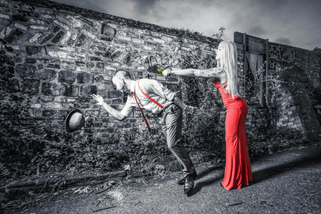
Selective color, also called color pop, is the idea of removing all but one color from an image. Rather than leaving a tone over everything, it was more about keeping one or more objects’ colors while turning everything else black and white. This effect is mostly used in movies.
- Using color grading
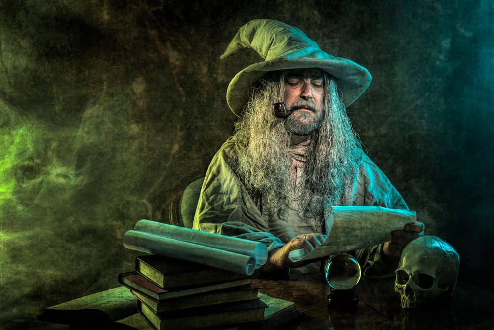
Color grading is the artistic and creative expression of colors to achieve a specific scene, bring a cohesive feel, or create a certain mood in photos or videos.
In photography, color grading is also known as split-toning due to the practice of adding 2 different tones to an image: one for the highlights and one for the shadows. A common example of this is adding a little yellow to the highlights and some blue to the shadows.
People often desaturate an image slightly before split-toning, or you can use the effect on an otherwise monochrome image or for a full-color image if you wish. The latter can sometimes lead to over-saturated results, hence the tendency to reduce saturation slightly before adding the extra tones.
Among the photo editing tools, Adobe Lightroom offers a very simple way of color grading with control over the highlights, midtones, and shadows. You can add in a hue and change the degree of saturation for luminosity.
- Signifying moods & associations
Color association is built up by relating to emotions, brands, politics, wealth, nature, and more. Colors have several meanings, varying depending on their use and context. The application of colors can be both usual and out of the norm. When commercially targeted, sticking to the convention is required to reach a wider audience. It is worth examining those associations with color that so often go by subconsciously so that we can use them more consciously. Here is a chart showing what colors are associated with industry.
| Color | Associated Mood | Industry |
|---|---|---|
| Red | Passion, Energy, and Urgency | Apparel, Automobile, Food |
| Green | Growth, Tranquility, Sustainability, Health | Food |
| Yellow | Clarity, Happiness, Optimism | Food |
| Blue | Credibility, Professionalism | Automobile, Food |
| Black | Sophistication, Dominance, Elegance, Authority | Apparel, Fashion |
| White | Simplicity, Minimalism, Purity, Cleanliness | Tech, Fashion, Health |
| Purple | Luxury, Royalty, Creativity | Beauty, Tech, Luxury products |
FAQs
What is color theory in photography?
Color theory refers to the behavior, interaction, combination, and effects of colors. Understanding color theory emphasizes the strategic and effective use of colors to alter viewers’ perspectives, highlight subjects, create moods, and convey messages.
What is color composition in photography?
Color composition in photography is the contemplative arrangement and placement of colors to create visually pleasing photos.
What color attracts the human eye most?
Vibrant and vivid colors attract the human eye most, such as red, orange, and yellow.
What is a color palette?
A color palette is a set of chosen colors specifically used for creating an artwork or fulfilling an editing task.
Final Overview
- Colors are a feature of an object; they hold the power to change mood, convince viewers, and deliver a message.
- The best way to implement colors after a photo session is to optimize images for color correction.
- Photoshop, Lightroom, Skylum Luminar Neo, PaintShop Pro, and DxO PhotoLab are popular photo editing software used for color correction.
- In the post-production process, colors are used to maintain consistency, create composition, and signify moods.
