
Tonal contrast in photography refers to the difference in brightness values between the lightest and darkest parts of images, which is measured through the luminance level of pure black to pure white. It creates visual differences in brightness, tone, and color in images.
There are 10 different types of contrast in photography, including tonal contrast, high contrast, low contrast, color contrast, scale contrast, conceptual contrast, etc. Professional photographers determine the use of contrast, taking note of 4 factors: subject, subject appearance, theme, and purpose of the photography. There are many ways to create tonal contrast in a photo, such as taking advantage of the exposure triangle, effective use of lighting sources, strategically using brightness and shadows, and editing photos.
What you’ll learn in this article
What is Tonal Contrast in Photography?
Tonal contrast in photography is the difference in brightness values between the lightest highlights and darkest shadows in an image. It extends the relations between highlights, midtones, and shadows across the luminance spectrum to determine the lighting level. The luminosity level of tonal contrast in a photo contributes to image dimensionality, depth, and visual separation.
Contrast in photography is the prevalent difference between the tones in a photo, such as lightness versus darkness, light colors versus dark colors, or bright areas versus shadowed areas, etc. As a subset of contrast, the tonal contrast focuses on image illumination levels, not color differences (chromatic properties). It is measured across a scale of pure black (0% luminance) to pure white (100% luminance).
- Higher Tonal Contrast – Higher Luminance Differences.
- Low Tonal Contrast – Minimal Variation in Brightness.
Cameras’ dynamic ranges influence tonal contrast. While the human eye perceives tonal contrast up to 20 stops, modern cameras are limited to only 12-14 stops, requiring professional photographers to manipulate tonal separation in photography and photo editing.
How Does Contrast Work in Photography?
Contrast work in photography by creating visual differences in brightness, tone, or color within an image. When the difference is vivid, it makes the image louder. On the other hand, when the difference is not that vivid, it makes the photograph calm. It results in emphasizing subject isolation and capturing viewers’ attention.
Professional photographers monitor contrast level in photography using histograms, exposure tools, and highlight/shadow warnings, or adjust it by applying post-processing techniques.
What is a Histogram?
A histogram is the visual representation through graphics of how images’ tones are distributed from pure black to pure white. The histogram shows shadows in the left, midtones in the center, and highlights in the right. Wide histograms show high global tonal contrast, and narrow histogram shows low contrast.
What is the Difference Between Tonal Contrast and Contrast?
The difference between tonal contrast and contrast is their field of differences in photography. Tonal contrast only covers the differences between lightness and darkness in photos. Contrast covers a broad range of visual variations between different elements in photos, such as brightness, darkness, subject separation, color texture, etc.
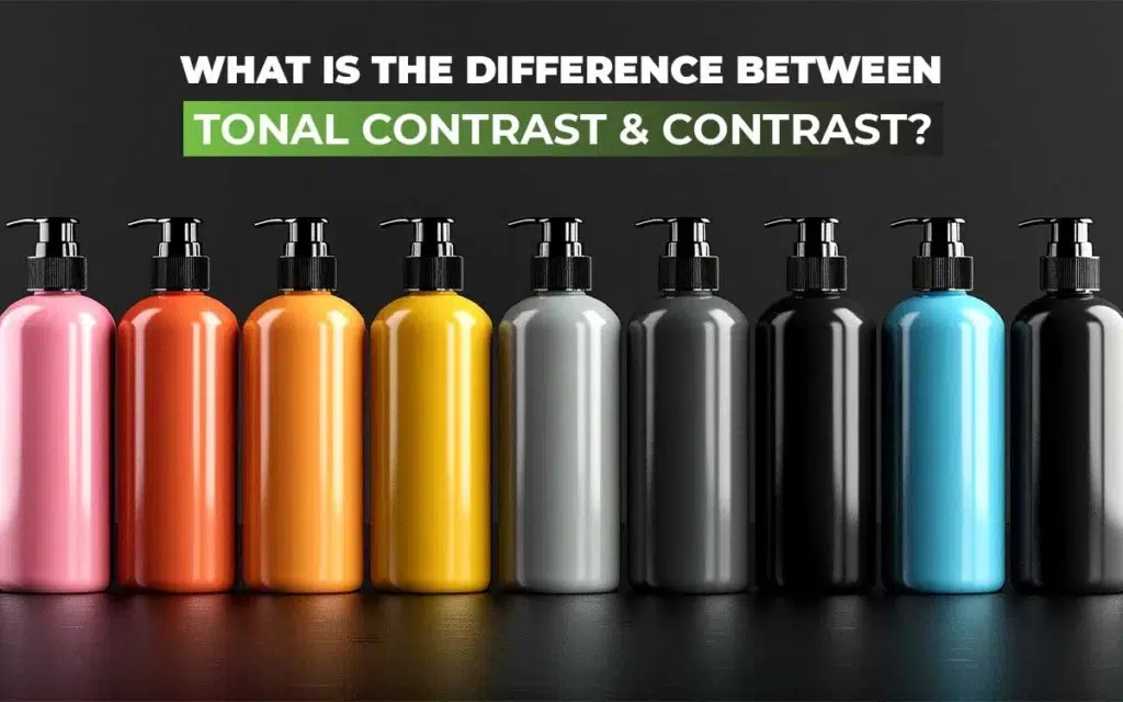
Contrast refers to the visual similarities, and tonal contrast is a subset of it. Contrast can be global, local chromatic, or structural, whereas tonal contrast extends around highlights, midtones, shadows, high contrast, low contrast, etc.
What is the Difference Between Color and Contrast?
The difference between color and contrast is how they appear. Colors in photos show how an object reflects light, which results in hue, saturation, brightness, etc. Contrast shows the visual difference of different objects and elements against brightness, darkness, colors, textures, or subject separation.
Other differences between contrast and color are as follows.
| Criteria | Color | Contrast |
|---|---|---|
| Purpose | Displays how objects reflect light. | Shows how an element appears in brightness or darkness. |
| Characterized by | Hue, saturation, and brightness. | Brightness, darkness, colors, size, etc. |
| Priority | Prioritizes individual hue and its quality. | Emphasizes the relationship between colors (how they differ). |
| Purpose | Used for delivering messages and conveying meaning. | Used for differentiating elements for visibility. |
| Example | A pair of blue shoes on a white background (blue and white showing color properties- saturation, hue, brightness). | The blue shoes stand out from the white background due to tonal and color contrast. |
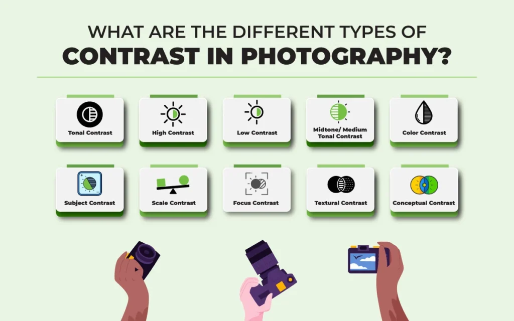
What are the Different Types of Contrast in Photography?
There are 10 different types of contrast in photography that are categorized into tonal contrast, high contrast, low contrast, color contrast, subject contrast, scale contrast, focus contrast, textural contrast, and conceptual contrast based on brightness, visual, concept, and chromatic properties.
1. Tonal Contrast
Tonal contrast is the difference in tones between elements (brightness, darkness) in photos. High contrast in tone creates dramatic images with vivid shadows, highlight separations, etc. Low contrast in tone produces subtle and atmospheric effects.
There are 2 types of tonal contrast used in photography: Global and Local.
- Global Tonal Contrast (high/low): Global tonal contrasts are the variations in tone, texture, etc, prevalent in the image. It affects the image’s range from brightest highlights to darkest shadows.
- Local Tonal Contrast: Local tonal contrast, also known as controlled tonal contrast, is the difference of dark and light in smaller areas in images. It checks tonal relations and makes details appear sharp.
The difference between global and local contrast is that global tonal contrast focuses on the overall image’s tonal spread, and local contrast enhances smaller parts and texture contrast in terms of brightness and darkness difference.
How is Tonal Contrast Applied in Photography?
Tonal contrast is applied in photography in 2 ways: High-key style and Low-key style. High-key contrast has a bright tone, minimal shadow, and low overall contrast. It creates an airy and positive vibe in images. Low-key contrast has dark tones, shadows are strong, and the contrast is high, which creates mysterious, dramatic, and moody effects.
2. High Contrast
High contrast is when the difference in light and dark in images is high. The presence of high contrast makes the visibility of luminance areas so vivid, vanishing the presence of midtones. High-contrast images contain more whites and more blacks.
3. Low Contrast
Low contrast is when the difference between dark and light in images is less. Opposite to high contrast images, low contrast images contain fewer whites and fewer blacks and are mostly created with midtones. As a result, photos appear soft, muted, and less intense than high contrast images.
4. Midtone/Medium Tonal Contrast
Medium contrast is the balance of the difference between low contrast and high contrast, neither high nor low. It enhances detail within a specific tonal range without impacting the light or dark areas in images. Midtones are used for adding photography depth and dimension.
5. Color Contrast
Color contrast is the difference in brightness, hue, saturation, and shades between colors in images. It analyzes how warm and cool colors interact and mostly uses color wheels as a guide. Each color has a specific tone, and the differences in light and dark tones create contrast.
6. Subject Contrast
Subject contrast is the difference between different elements in a photographic frame, including the subject, in terms of colors, textures, tones, or size. Differences between light and dark, differences in color scale, and differences in complementary colors all create contrasts. Subject contrast is used to show visual variations and emphasize subjects.
7. Scale Contrast
Scale contrast is the visual difference of element size through the appearance of shades or colors in photos. It highlights how big or small an item is within the photography frame. Scale contrast is created through perspective manipulation. It is used for demonstrating scale connection and enhancing 3D perception.
8. Focus Contrast
Focus contrast is the deliberate use of contrast while keeping the subject in focus and blurring the less important areas. In contrast, selective sharpness is applied for controlled depth of field. Focus contrast is used for guiding viewers’ focus to a specific subject, creating visual hierarchy.
9. Textural Contrast
Textural contrast is the difference in texture and material properties of different surfaces in images. It displays micro-level variation, highlighting surface quality and appearance of different surfaces. As a result, the texture in photos appears smooth, glossy, rough, or matte depending on the subject and composition.
10. Conceptual Contrast
Conceptual contrast is a visual difference of concepts, emotions, ideas, and subjects, rather than just luminance in photos. Unlike other contrasts that show visual differences, conceptual contrast is abstract and relies on photographers ‘ ideas. Conceptual contrast is used for storytelling purposes to evoke viewers’ emotions, deliver a unique perspective, or add depth to the photos.
How to Use Contrast for Different Photography Styles?
To use contrast for different photography styles, consider these 4 factors: subject, appearance, theme, and purpose. Use of contrasts at different luminance levels has an impact on the viewer’s perception, which contributes to the photo’s commercial long-term goals.
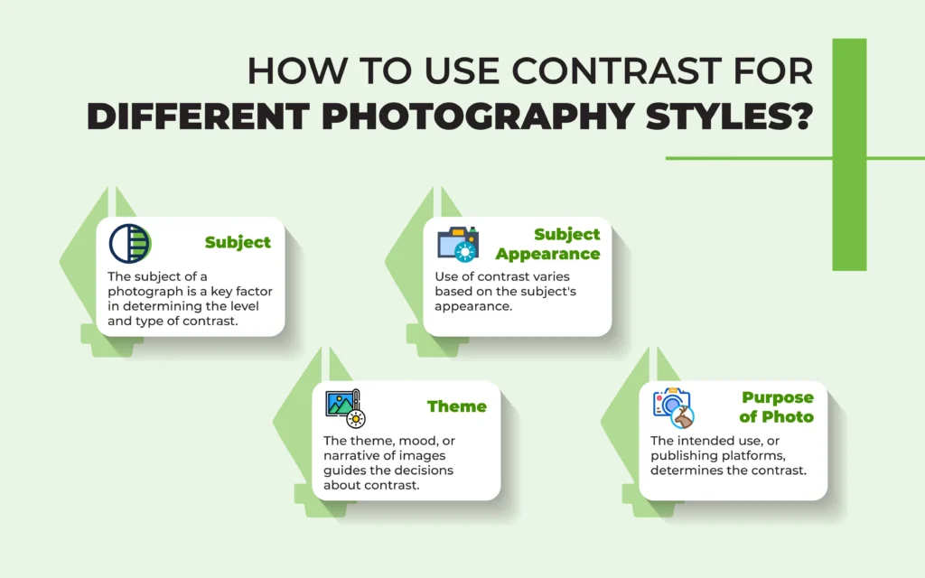
- Subject: The subject of a photograph is a key factor in determining the level and type of contrast. Contrast choices vary significantly depending on human and non-human, and even within human photography, such as portrait photography and headshot photography. Proper contrast enhances shape, texture, and visual separation.
- Subject Appearance: Use of contrast varies based on the subject’s appearance. Texture, material finish, and natural light conditions everything gets influenced by contrast. A professional presentation requires a well-lit setup because clarity matters. Creative use of contrast creates dramatic photos, making viewers curious.
- Theme: The theme, mood, or narrative of images guides the decisions about contrast. High-tonal contrast creates dramatic effects, and low contrast creates soft, serene scenes.
- Purpose of Photo: The intended use, or publishing platforms, determines the contrast choices to create viewer-focused and stylistic photos.
Contrast level creates light and airy style, monochromatic style, dramatic style, and moody style, depending on the photography genre as follows.
| Photography Genre | Contrast Level | Outcome |
|---|---|---|
| Product Photography | Controlled tonal contrast | Brings an outstanding appearance of textures and material properties |
| Local contrast adjustments | Emphasizes reflective surfaces or fine details | |
| Model Photography | Low tonal contrast | Smooths skin, softens shadows, creates a gentle, flattering look. |
| High tonal contrast | Highlights facial features and structures, textures, and creates dramatic expressions. | |
| Landscape Photography | High tonal contrast | Adds depth in foreground, midground, and background, and improves texture. |
| Low tonal contrast | Sets the right mood and serene effects in dawn/dusk scenes. | |
| Outdoor Photography | High contrast | Highlights shadows, silhouettes in photos. |
| Tonal separation | Emphasizes storytelling elements and strategically guides viewers’ attention. |
Why is Tonal Contrast Important in Photography?
Tonal contrast is important in photography to add depth, create 3d perception, and shape the atmosphere and mood. Appropriate use of contrast makes the image appear dynamic and full of dimensional qualities. These types of images become compositionally strong, helping viewers interpret the content.
Across different photography genres-from e-commerce product photography, car photography, outdoor photography, and lifestyle photography-tonal contrast benefits businesses and brands by addressing image issues and balancing luminance as follows.
| Flat, snapshot-like images➡Proper tonal contrast adds depth and visual hierarchy. Indistinct subjects with weak shadows/highlights➡Balanced contrast defines edges, textures, and tonal separation. Blown highlights/blocked shadows➡Controlled contrast preserves detail across the tonal range. |
Contrast creates luminance boundaries that help people to distinguish objects. Also, accurate contrast benefits a business’s SEO activities as it contributes to creating high-quality and attractive visuals at a reduced size. High-contrast images exhibit energy and tension. Low-contrast photographs displayed tranquility and subtlety. Contrasts make such a psychological effect for visual storytelling and artistic expression.
How Do You Create a Tonal Contrast in a Photo?
To create tonal contrast in a photo, take advantage of the exposure triangle, understand different lighting source and their work style, implement brightness and shadow strategically, use different photography composition techniques, feature dramatic framing while shooting, and last but not least edit your photos.
1. Take Advantage of the Exposure Triangle
Adjusting the right exposure triangles-ISO, aperture, and shutter speed assists in creating tonal contrast in photography. Those 3 elements are interdependent and affect the visibility of lightness and darkness in photos. As tonal contrast varies depending on the subject, determine what you want to focus on in the frame. For example, camera settings for e-commerce product photography and social media photography differ.
Adjusting the right exposure triangles-ISO, aperture, and shutter speed assists in creating tonal contrast in photography. Those 3 elements are interdependent and affect the visibility of lightness and darkness in photos. As tonal contrast varies depending on the subject, determine what you want to focus on in the frame. Camera settings for product photography and social media photography differ. E-commerce requires setting the exposure triangle to make products look professional and well-lit. Social media or lifestyle product photography allows photographers’ creative freedom, though.
- Camera Settings of Aperture f/8 to f/11: shutter speed 1/200s, and ISO 100 will produce high contrast, which will clean shadows, increasing tonal separation for e-commerce photographs.
- Camera Settings of Aperture f/5.6: shutter speed 1/100s, and ISO 200-400 will create low contrast, which is used for lifestyle product photography.
2. Understand Different Lighting Source and Their Work Style
The presence of lighting is significant in creating tonal contrast in photography. Lighting direction, light quality, types of light (natural or artificial everything counts.
- Natural Lighting: Outdoor shooting mostly relies on natural lighting. Shooting subjects in bright light or bright attire creates high contrast in tone in images. Shooting during morning or afternoon mutes the harsh rays, producing a low-contrast tone in photos.
- Artificial Lighting: Use of hard light or soft light impacts the contrast in the photography frame. Artificial hard lights such as bare strobes, spotlights, etc, produce sharp shadows and high contrast. Using soft light sources such as diffusion panels, softboxes, and umbrellas creates a lower contrast transition.
- Light Direction: Light direction emphasizes the level of tonal contrast in a photo. Setting it directly towards the subject, the shadows will be harsh, resulting in high-contrast images. On the contrary, placing light slightly differently, using a diffuser, or using back light will soften the light and shadow harshness, creating low contrast images.
- Lighting Quality: Quality of light refers to the intensity of the light. Highly intense light produces bright illumination and hard shadows, resulting in high-contrast images. Shooting in less intensity, such as during dawn or evening, shadows appear soft, creating low-contrast images.
3. Implement Brightness and Shadow Strategically
Placing both brightness and dark shadows inside a photography frame complements each other. Considering your photography context, use a variation of light and darkness through elements, setup, foreground, and background to create the right tonal contrast.
4. Explore Photography Composition Techniques
Using photography compositional technique is a highly effective method to create tonal contrast in photos. Techniques such as manipulating light, selective use of colors and shadow, framing techniques, leading lights, monochromatic colors, curves, etc, can lead viewers’ attention, making them concentrate on a specific part of the body to evoke curiosity to explore more images.
5. Feature Dramatic Framing While Shooting
Dramatic framing refers to creating a unique perception in photography. To create tonal contrast, explore ideas, concepts, and sudden abstract thoughts for your camera frame.
6. Edit Your Photos
Image editing allows photographers to use creative applications of tonal contrast. Photo editing software offers different features such as levels, curves, selective color adjustments, color balance, etc, to adjust high-tone, midtone, and low-tone contrast in images.
How to Get the Perfect Tonal Contrast in Camera?
To get the perfect tonal contrast in camera, consider your subject and light. To achieve high tonal contrast, consider shooting the subject against a contrasting background, such as using direct and bright light on one side and deep shadow on the other, or placing a bright subject on a bright background. To achieve medium tonal contrast, shoot during the morning or the afternoon. To create low contrast, shoot an evenly lit subject, a subject with a backlit, muted, or gray subject against a dark background.
How to Adjust Tonal Contrast in Post Using Curves?
To adjust tonal contrast in post using curves, use robust photo editing tools (i.e., Adobe Photoshop, Adobe Lightroom) and follow these steps.
1. Open the Curves Panel: The curve panel displays a diagonal line indicating tonal range.
2. Create an S-curve: slightly lower the shadows (on the left), and raise the highlights (on the right). This step will increase the overall contrast in photos.
3. Edit Specific Portions of the Curve: It can be midtones or quartertones. The process should enhance details without harming the entire tonal range.
4. Make Small Changes: To avoid clipping shadows or blown-out highlights.
5. Now Preview Toggle: before/after views to check how the contrast appears. A well-adjusted tonal range will enhance dimensionality and depth with image detail.
Can Too Much Contrast Ruin a Photo?
Yes, too much contrast can ruin a photo by causing loss of detail, burnout, posterization, color distortion, noise, poor print reproduction, etc. It makes images visually imbalanced and rough. These create viewer fatigue, reducing engagement and conversion, harming commercial intent. To address the excess contrast, retain detail across the tonal range, and prevent the photo from damage, HDR photography techniques assist.
FAQ’s
What is the best setting for contrast?
The best setting for contrast is decided based on the subject, scenery, and purpose instead of following a single criterion. Check the histogram to decide it. Choose high contrast for detail work, such as photo editing, and moderate contrast for prolonged reading.
What is the rule of contrast in photography?
The rule of contrast in photography is to use diverse contrast elements(brightness, tone, color) for the viewers to differentiate the subject and enhance visual impact. High contrast images are bright in highlights and dark shadows, and vice versa. So, fine-tune contrast while shooting and during editing.
Is high or low contrast better?
Both high and low contrasts are better in photography, considering the subject, lighting conditions, and purpose of the photography. High contrast works better to create dynamism and visibility, whereas low contrast works better to create peace and softness in images. Professional-grade photography requires balanced use of contrast.
How do I know my contrast level?
To know the contrast level for your images, check your photos in grayscale or take shots in black and white filters. Assess the lightness and darkness level of hair, skin, and eyes. The same value indicates low contrast, and skin with a different value indicates high contrast.
Which image adjustment should you use to increase contrast?
The image adjustment you should use to increase contrast is curves or levels, available in Photoshop and Lightroom. You can also increase highlights or intensify shadows to add contrast. Use a histogram to increase and adjust contrast while shooting photos under different lighting conditions.
Which technique can a photographer use to increase contrast in an image?
The technique a photographer can use to increase contrast in an image is using harsh light against a light background. Apart from that, there are plenty of other ways, such as shooting in broad daylight, placing light on one side of the subject, etc. Strategic use of lightness and darkness is the best way to increase or decrease contrast.
Which filter will adjust the contrast of the image?
The filter that will adjust the contrast of the image is the Brightness or Contrast filter in Photoshop. This filter increases color intensity between text and background, allowing for enhanced or adjusted contrast. Other tools, such as Camera Raw Filter, Levels, and Curves, also offer precise control over tonal contrast adjustment.
Which Graphic filter increases the contrast of an image?
The graphic filter that increases the contrast of an image isn’t a single one, but many options, for example, Brightness or Contrast Graphic filter, Curves, Levels, and Camera Raw. Brightness/Contrast allows fast adjustments, and Camera Raw, Curve, or Levels offer refined control over contrast. All these filters enhance light-dark separation, improving photographic clarity and depth.
