
In Photoshop, “Match Color” is a tool that helps you to adjust an image’s color temperature, tint, hue, saturation, and brightness until the colors look natural and realistic. Color matching is useful for blending elements from different images, correcting color inconsistencies due to lighting, or creating a uniform color palette across multiple images.
There are 4 easy and effective ways, such as matching one color to another within a single image, matching the coloring between two images, matching a color selection in one image to a selection in another, and manual matching with Eyedropper. Whether you’re a beginner or a seasoned professional, you will gain valuable insights and techniques for accurately matching colors in Photoshop.
This guide offers you basic color theory and advanced strategies for achieving optimal color harmony. With the tools and knowledge provided, readers can take their color-matching skills to the next level and produce professional-looking graphic designs and photographs.
What you’ll learn in this article
- 1 What is Color Matching in Photography?
- 2 What is the Purpose of Color Matching?
- 3 How to Match One Color to Another Within a Single Image in Photoshop?
- 4 How to Match the Coloring Between Two Images in Photoshop?
- 5 How to Match a Color from a Selection in One Image to a Selection in Another?
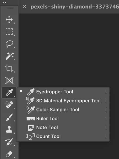
- 6 How to Match Colors in Photoshop Using the Eyedropper Tool?
- 7 Tips for Better Color Matching in Photoshop
- 8 What are the Common Mistakes to Avoid in Color Matching?
- 8.1 Mistake 1: Using the Wrong Color Mode (RGB vs. CMYK)
- 8.2 Mistake 2: Ignoring Monitor Calibration and Color Profiles
- 8.3 Mistake 3: Overusing Auto Adjustments without Fine-tuning
- 8.4 Mistake 4: Not Using Adjustment Layers
- 8.5 Mistake 5: Inconsistent White Balance
- 8.6 Mistake 6: Not Checking Final Output (Print vs. Web)
- 8.7 Mistake 7: Manual Color Matching Without Using Tools
- 9 Where to Get Consistent and Accurate Color Matching?
- 10 FAQs About Matching Image Colors in Photoshop
- 11 Final Overview
What is Color Matching in Photography?
Color matching in photography is the process of adjusting the color balance of an image to ensure that the colors appear true to life. This is particularly important in commercial photography, where products must be accurately represented to potential customers.
Color matching involves adjusting an image’s color temperature, tint, saturation, and brightness until the colors look natural and realistic. In Photoshop, color matching is achieved through adjustment layers, color correction tools, and other advanced techniques.
What is the Purpose of Color Matching?
Enhance the Appeal of Products
Color matching is necessary for commercial photography to represent a product’s colors accurately. This helps potential customers better understand the product they are considering purchasing, which can enhance its appeal.
Demonstrate Different Versions of a Motif
Color matching allows designers to demonstrate different motif versions, such as a logo or brand identity, across multiple mediums while maintaining a consistent appearance.
Using Color in Visual Storytelling
Color can have a significant impact on the emotions and moods that a photograph or design conveys. By adjusting colors in an image, an expert can help guide the viewer’s eye and communicate emotions and moods more effectively.
Form a Consistent Appearance
One of the primary purposes of color matching is to establish consistency across various designs or photographs.
This is particularly important in branding and marketing campaigns where maintaining a consistent visual identity is key to building brand recognition.
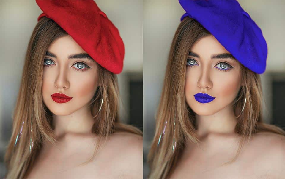
How to Match One Color to Another Within a Single Image in Photoshop?
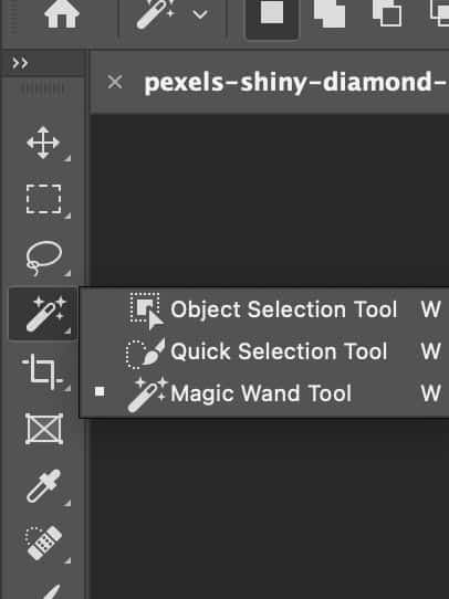
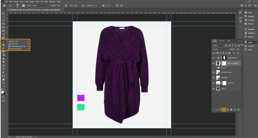
To match one color to another within a single image in Photoshop, use the “Eyedropper tool” to pick the matched color. After that, use the Photoshop selection tool, like the Magic Wand tool or the Lasso tool, to select the area you want to change the color. Below we’ve presented a step-by-step guide with more details:
Step 1: Identify the Colors to be Matched
The first step in color matching within a single image is identifying the colors that need matching. This may be necessary if different parts of an image have been shot under different lighting conditions or if the colors have simply shifted due to incorrect camera settings.
Select the color as the source color by clicking directly on the image. When you’ve done this, you can use it as a reference when adjusting your hue and saturation layer, which is discussed in later steps.
Step 2: Select the Color to be Changed
Next, select the color that needs to be changed. This can be done using the Magic Wand or Lasso tool to select the area containing the color.
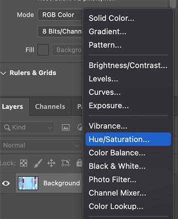
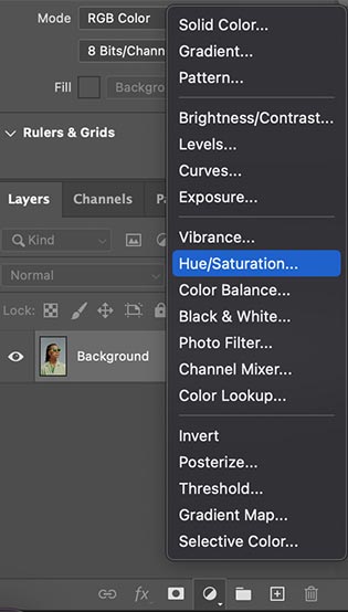
Step 3: Create a New Adjustment Layer
With the color selected, create a new adjustment layer by clicking the Adjustment Layer button in the Layers panel and selecting the appropriate adjustment layer. For example, to adjust the hue and saturation of a color, select the Hue/Saturation adjustment layer.
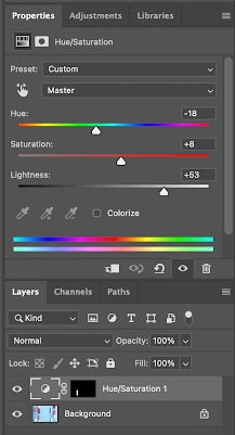
Step 4: Adjust the Color
With the adjustment layer created, adjust the color to match the desired color using the sliders in the adjustment layer panel. For example, to match a green color to a blue color, adjust the hue slider until the green color appears bluer.
Step 5: Refine the Adjustment
Once the initial adjustment has been made, refine it by using the layer mask to mask any unwanted areas or using the brush tool to paint over areas requiring further adjustment.
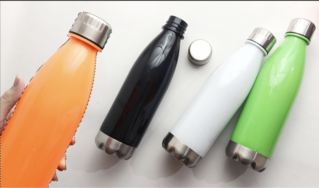
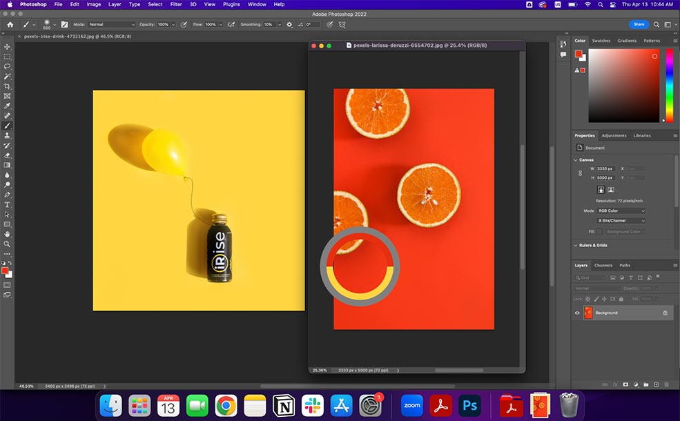
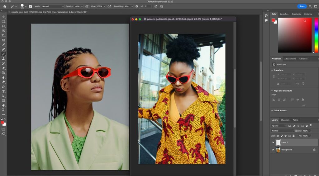
How to Match the Coloring Between Two Images in Photoshop?
You can match the coloring between two images by making a selection in the source and target images. Here’s a step-by-step guide:
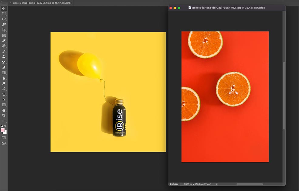
Step 1: Open the Images in Photoshop
Open both images in Photoshop by selecting File > Open and browsing for the images you want to work with. Ensure that both images are open in separate tabs.
Step 2: Identify the Colors to be Matched

The next step is to identify the colors that must be matched between the two images. This may be necessary if the images were shot under different lighting conditions or if the colors have simply shifted due to incorrect camera settings. You can do this by selecting the Eyedropper tool and left-clicking the source color.
You can refer back to this color when adjusting the Hue and saturation layer.
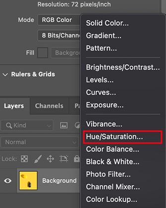
Step 3: Create a New Adjustment Layer
With both images open, create a new adjustment layer in the image that requires the color adjustment by clicking on the Adjustment Layer button in the Layers panel and selecting the appropriate adjustment layer. For example, to adjust the hue and saturation of a color, select the Hue/Saturation adjustment layer.
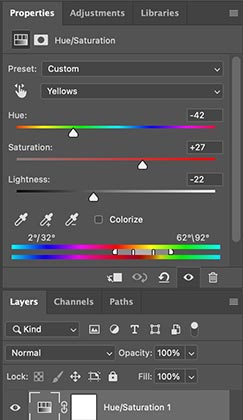
Step 4: Apply the Adjustment
Using the sliders in the adjustment layer panel, adjust the color until it matches the reference color in the other image. For example, if a blue sky in one image is much brighter than the same blue sky in the other, adjust the brightness and saturation sliders until the colors match.
Step 5: Invert the Layer Mask

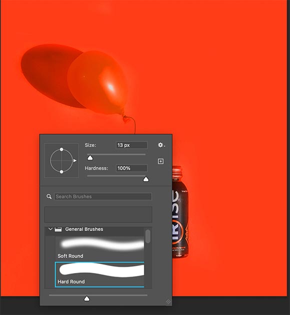
Once you are happy with the color in your hue and saturation slider, you can invert the layer mask by pressing Command + I (Mac) or Control + I (Windows). Paint with a hard brush around the edges with a black paintbrush. That way you are removing the layer from the selection.
Adjust the painting accordingly to make it look realistic.
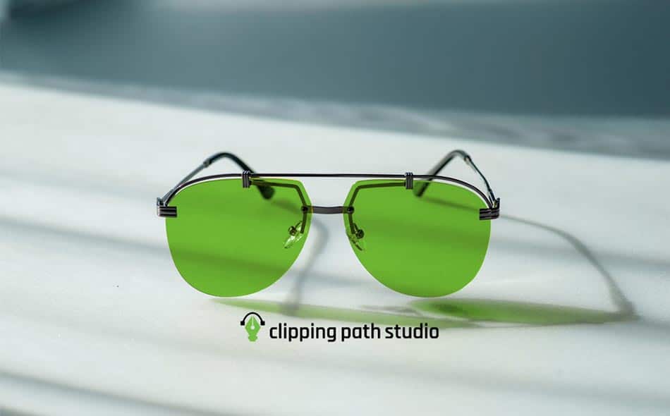
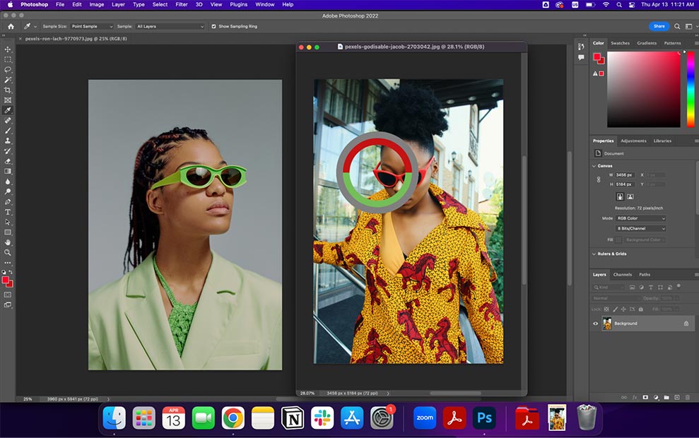
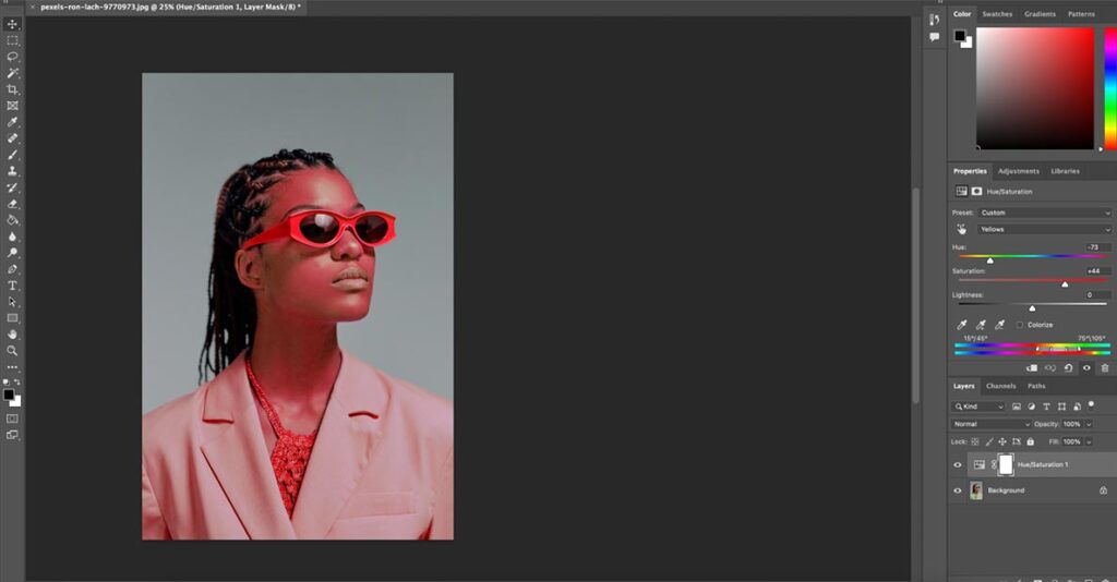
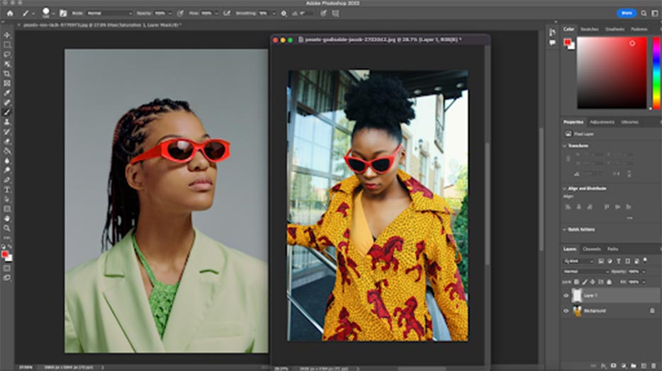
How to Match a Color from a Selection in One Image to a Selection in Another?
Matching colors from one image to another involves several steps when working with images for precise color reproduction or adjustments. Here’s a step-by-step guide:
Step 1: Open the Images in Photoshop
Open both images in Photoshop by selecting File > Open and browsing for the images you want to work with. Ensure that both images are open in separate tabs.
Step 2: Identify the Colors to be Matched
The next step is to identify the colors that must be matched between the two images. This may be necessary if the images were shot under different lighting conditions or if the colors have simply shifted due to incorrect camera settings.
You can select your eyedropper tool and click the source color. This will help you when you are adjusting your Hue and Saturation layer, that is mentioned later on in this tutorial.
Step 3: Create a New Adjustment Layer
With both images open, create a new adjustment layer in the image that requires the color adjustment by clicking on the Adjustment Layer button in the Layers panel and selecting the appropriate adjustment layer. For example, to adjust the hue and saturation of a color, select the Hue/Saturation adjustment layer.
Step 4: Apply the Adjustment
Using the sliders in the adjustment layer panel, adjust the color until it matches the reference color in the other image. For example, if a blue sky in one image is much brighter than the same blue sky in the other, adjust the brightness and saturation sliders until the colors match.
Invert your mask by pressing Command + I (Mac), Control + I (Windows) to hide your color adjustment.
Step 5: Refine the Adjustment
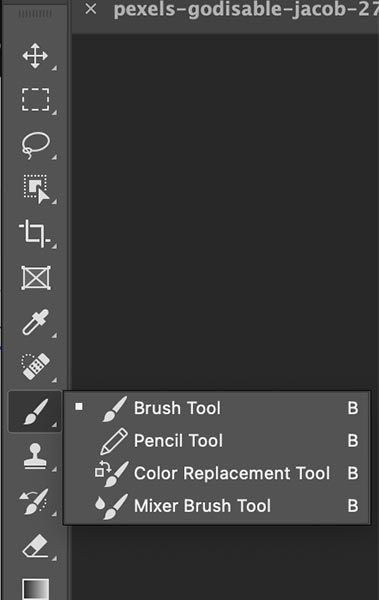
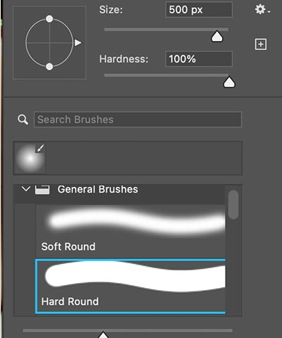
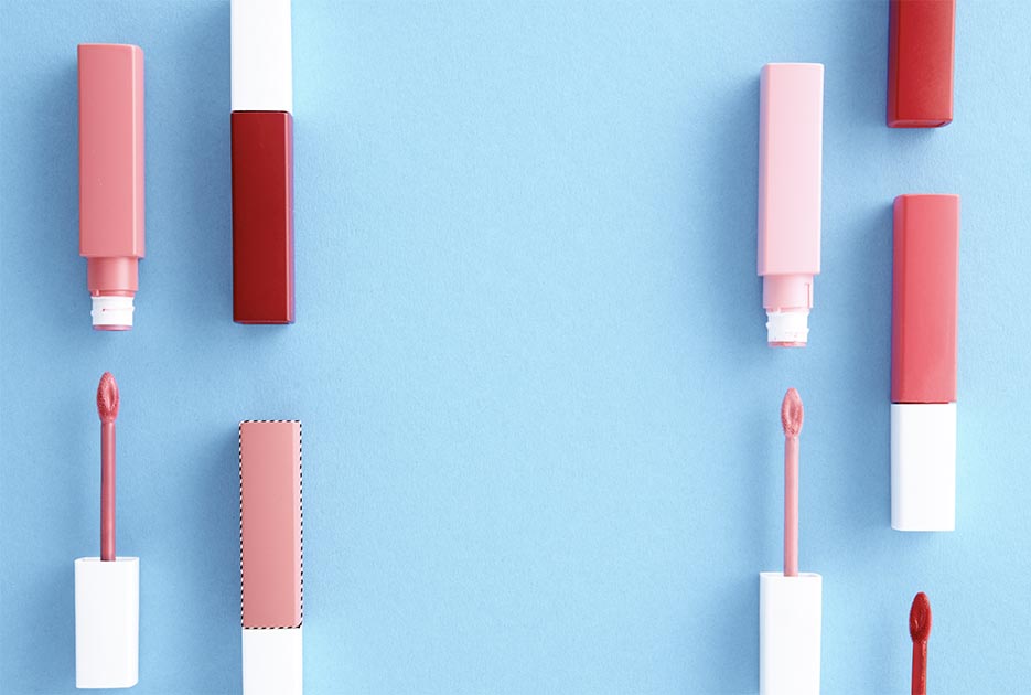
Once the initial adjustment has been made, refine it by using the layer mask to mask any unwanted areas or using the brush tool to paint over areas requiring further adjustment. Do this by selecting the brush tool, selecting a hard brush, and painting over the masked area on your image.
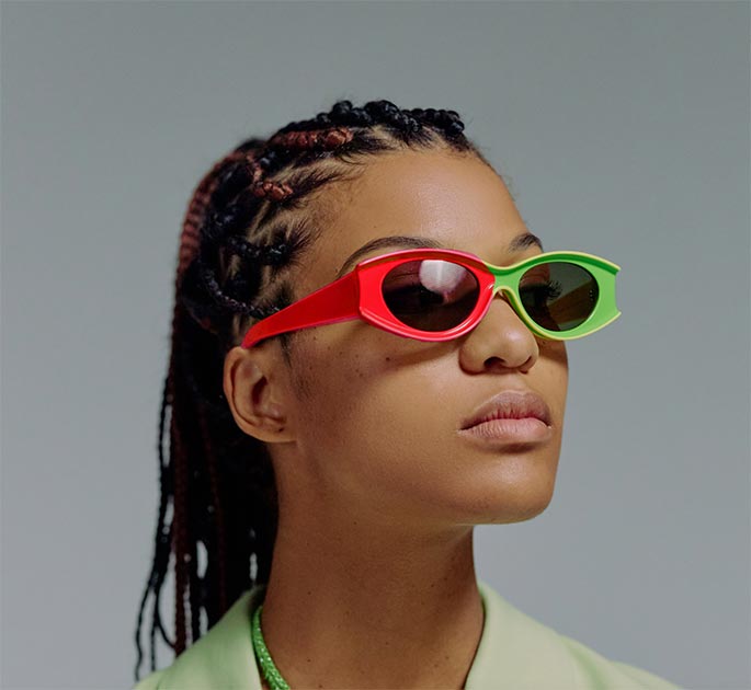
Once you have selected the hard brush, you can paint over the specific section of the image. Below is an example of the brush painting over the glasses.
How to Match Colors in Photoshop Using the Eyedropper Tool?
To manually match colors using the Photoshop Eyedropper tool, first sample the desired color with the Eyedropper tool, create an Adjustment Layer, and adjust it to match the sampled color tone. Here’s a step-by-step guide:
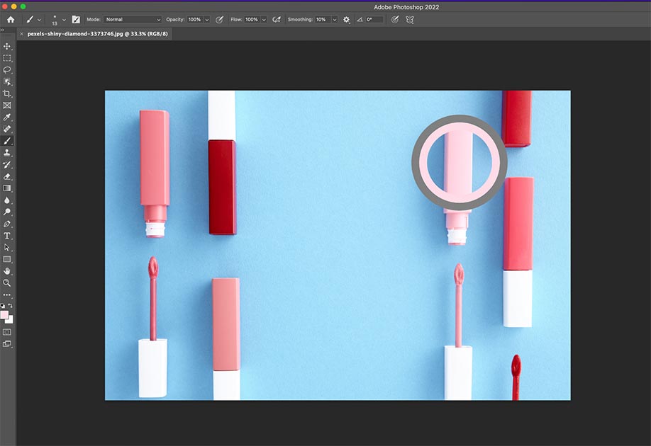
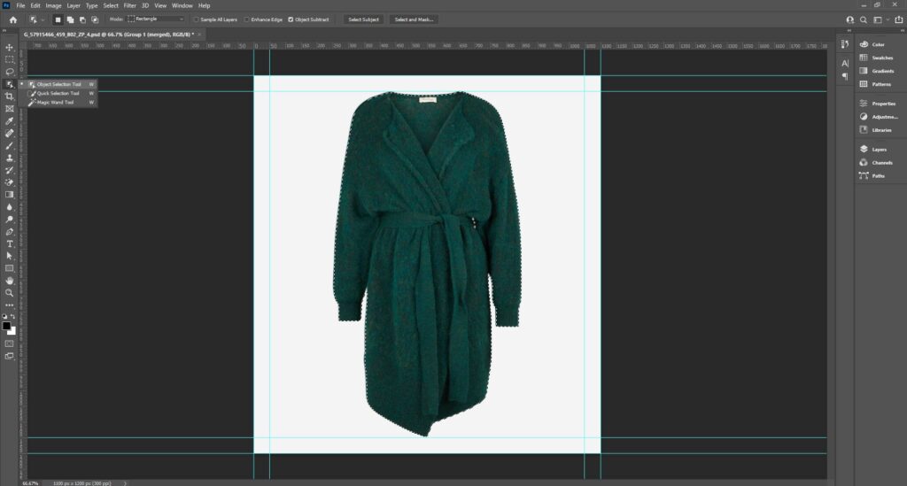
Step 1: Select the Target Object
Use the Object Selection tool (shortcut W) or the Lasso tool (Shortcut L) to separate the object you want to recolor. Refine the selection with Select and Mask to smooth the edges.
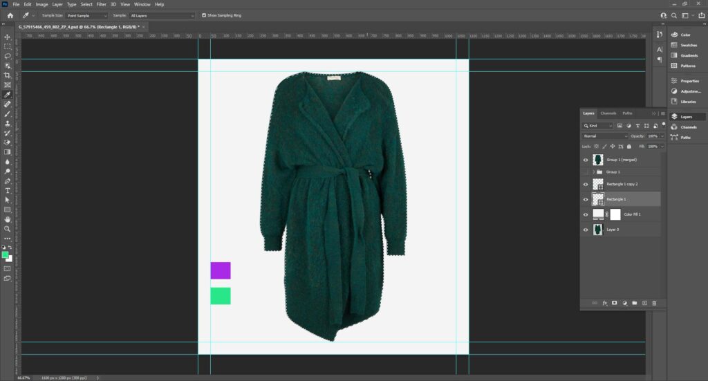
Step 2: Sample the Reference Color
Use the keyboard shortcut key I to activate the Eyedropper tool and click on the color you want to match in your image.
Note: Sample multiple colors and paint them on a new layer near the object for better accuracy.
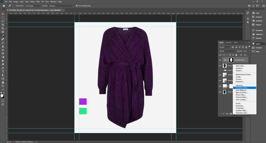
Step 3: Create an Adjustment Layer
Go to Layers > New Adjustment Layer and choose an Adjustment Layer type based on your needs (e.g., Hue/Saturation for color shifts, Levels, or Curves).
Step 4: Fine-tune with Layer Masks
If the adjustment affects unintended areas, click the layer mask and use a brush with black paint to hide the adjustment layer’s effect on certain areas or parts of the image. You can also use gray paint to hide the effect partially.
Step 5: Use Curves or Levels for Precision
You can add a Curves or Levels Adjustment Layer for complex color shifts. Sample highlights, midtones, and shadows from the reference to adjust individual channels (RGB, Red, Green, Blue).
Step 6: Refine Under Different Lighting
Check your work under standardized lighting (e.g., a neutral white background) to ensure consistency. Toggle adjustment layers on/off to compare before/after results.
Video tutorial on Match Colors in Photoshop by expert Joshua Malik –
Tips for Better Color Matching in Photoshop
For better color matching in Photoshop, you can –
- Experiment with different brush sizes and opacity levels to create a more precise and natural color match.
- Utilize adjustment layers like Curves, Hue/Saturation, and Levels.
- Understand your source and target images.
- Use the eyedropper tool to sample the Layer’s color.
- Use the adjustment of the Layer Mask.
- Experiment with different blend modes and reduce the opacity of adjustment layers.
What are the Common Mistakes to Avoid in Color Matching?
Common mistakes to avoid in color matching are ignoring white balance, over-saturating colors, using the wrong color mode, ignoring monitor calibration, and not using Adjustment Layers. When all these issues happen, your product images look dull and unrealistic. When it’s time to replace photo color or color matching, there are 7 common mistakes you should avoid, including:
Mistake 1: Using the Wrong Color Mode (RGB vs. CMYK)
Do you attempt to match colors in CMYK mode or mix color modes? If yes, the product image causes unexpected shifts.
Solution: Work in RGB mode when color matching in Photoshop and convert to CMYK after finalizing colors for print.
Mistake 2: Ignoring Monitor Calibration and Color Profiles
Colors look different on various devices or when exported.
Solution:
- Always set the correct color profile (sRGB for web, Adobe RGB, or CMYK for print).
- Go to Edit > Color Settings and choose the appropriate profile.
- When exporting, use File > Export As and ensure “Convert to sRGB” is checked for web images.
Mistake 3: Overusing Auto Adjustments without Fine-tuning
Relying on Photoshop’s Auto Color or Match Color without manual adjustments can result in unnatural results.
Solution: After using Match Color, adjust luminance, color intensity, and fade sliders to match the product color with its background.
Mistake 4: Not Using Adjustment Layers
Applying color corrections on image layers can cause unintended changes to other parts.
Solution: Always use the Adjustment Layers to work non-destructively and make it easier to fine-tune.
Mistake 5: Inconsistent White Balance
Composed images look mismatched or fake.
Solution:
- Match white balance across layers.
- Add a Photo Filter adjustment layer to harmonize temperature across different layers.
Mistake 6: Not Checking Final Output (Print vs. Web)
The final colors look wrong when printed or uploaded.
Solution: Use View > Proof Setup to simulate the output (e.g., for CMYK print).
Mistake 7: Manual Color Matching Without Using Tools
Problem: Manual adjustments can lead to inconsistent or inaccurate results.
Solution:
- Use Curves or Levels Adjustment Layers for controlled corrections.
- Use the Eyedropper Tool to get the exact RGB values.
- Match tone between layers using Image > Adjustments > Match Color, which can match the color tone from one image or layer to another.
Where to Get Consistent and Accurate Color Matching?
You can get consistent and accurate color correction or color matching services from professional photo editing agencies, like Clipping Path Studio. They have in-house photo editing experts who use the latest advanced technology and software to fulfill clients’ business-specific requirements. Whether you’re a professional photographer, a marketing professional, or an entrepreneur, you’ll get –
- Accurate color correction & grading to make colors pop, maintaining natural tones.
- Color separation & multiple filling for individual adjustments.
- Removal of color casts and tonal balancing to achieve true-to-life colors.
- Image enhancement & retouching.
- Support for e-commerce and marketing needs.
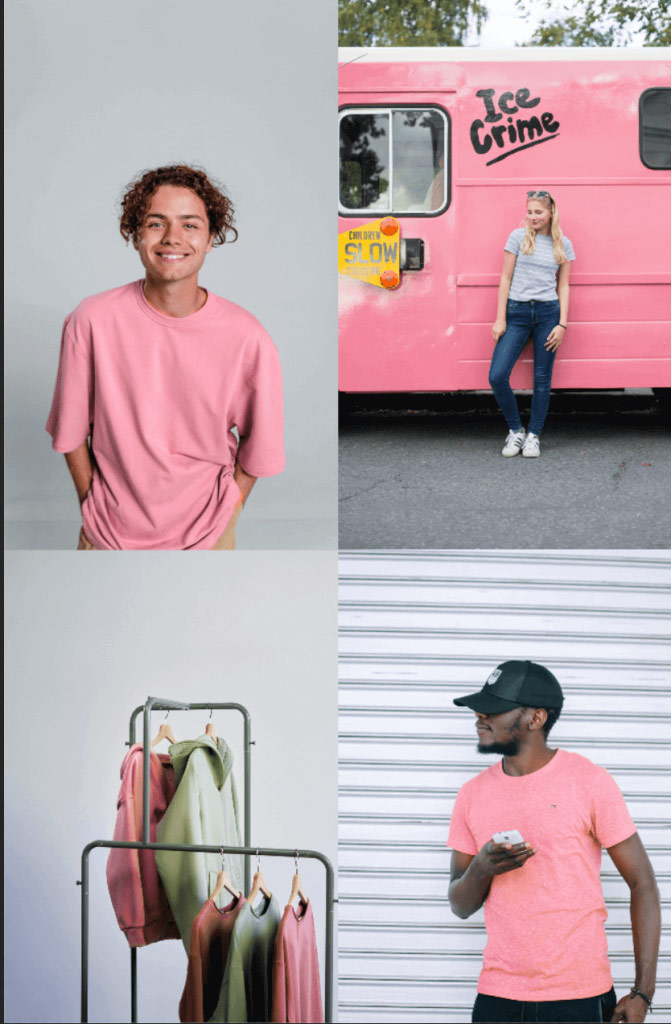
Photoshop color matching plays a significant role in e-commerce product listings, displaying product variations accurately, and representing products on matching backgrounds. Do your online products need bulk color correction, editing, or urgent project completion? Outsource from CPS and get budget-friendly, brand-specific, tailored solutions within delivery time.
FAQs About Matching Image Colors in Photoshop
How does the Match Color tool work?
The Match Color tool analyzes the color values in both the source and target images and then applies adjustments to the target image to match the source image’s color. It offers various options for adjusting the intensity of the effect and preserving skin tones.
How do I know what colors go together?
Color theory can be a helpful guide for determining which colors go well together. This includes understanding complementary colors, analogous colors, and color temperature. Many online resources and color palette generators can help you choose a cohesive photo color scheme.
How do I access the Match Color tool in Photoshop?
The Match Color tool can be found under the Image > Adjustments menu in Photoshop. It can also be accessed through the keyboard shortcut Ctrl + Alt + Shift + L (Win) or Command + Option + Shift + L (Mac).
What are the requirements for using the Match Color tool?
To use the Match Color tool, both images must be in the RGB color mode and have the same resolution. The tool works best when the images have similar lighting conditions and color temperatures.
Can I match the colors of an entire image or just a selected area?
The Match Color tool can match the colors of an entire image or a selected area. To match colors in a selected area, simply make the selection before accessing the Match Color tool.
Can I adjust the intensity of the Match Color effect?
Yes, the Match Color tool offers options for adjusting the intensity of the effect, including the Luminance, Color Intensity, and Fade sliders.
Is it possible to match colors between images taken in different lighting conditions?
While the Match Color tool is designed to work best with images in similar lighting conditions, it is still possible to match colors between images in different lighting conditions. However, achieving an exact match may require additional adjustments.
Can the Match Color tool be used in batch processing?
Yes, the Match Color tool can be used in batch processing by creating an action in Photoshop. This allows you to simultaneously apply the Match Color effect to multiple images, saving time and effort.
Can I save Match Color settings for future use?
Yes, the Match Color tool allows you to save your settings as a preset for future use. This can help achieve consistent color matching across multiple images.
Final Overview
- Color matching in photography is the process of adjusting the color balance of an image to ensure that the colors appear true to life.
- There are 4 easy and effective ways, such as matching one color to another within a single image, matching the coloring between two images, matching a color selection in one image to a selection in another, and manual matching with Eyedropper.
- The purpose of color matching is to enhance product appeal, demonstrate different product versions, use color in visual storytelling, and maintain a consistent appearance across e-commerce product listings.
- Some common mistakes to avoid in color matching are: using the wrong color mode, ignoring monitor calibration and color profiles, overusing Auto Adjustments without fine-tuning, not using Adjustment Layers, inconsistent white balance, etc.
