
Photo color correction refers to applying color for the accurate representation of the subject. The color editing process adjusts several terms such as white balance, exposure, contrast, highlight, mid-tones, shadow, brightness, hue, temperature, etc. Professionally edited colors reflect originality, remove viewers’ discrepancies on colors, eliminate flaws, and convince viewers.
Color correction’s importance is mostly in e-commerce product listings for displaying product varieties, maintaining brand consistency, and increasing product sales. There are several ways to apply color correction in a photo, including a calibration tool, implementing histogram and waveform, adjusting color tone curves, etc. Adobe Photoshop is the most prominent tool used for photo color correction. Other software includes Adobe Lightroom, Skylum Luminar Neo, PaintShop Pro, and DXO PhotoLab.
Several mistakes may occur when applying color adjustments to photos. Outsourcing professional photo color correction services would ensure that high-quality, picture-perfect images are ready for distribution. Professional image color correction prices start at $0.99 in New York, USA.
What is Photo Color Correction in Photography?
Photo color correction in photography is the photo editing process of adjusting colors, temperature, hue, and saturation to bring natural and appealing colors to the images. Color correction is required when the subject in images doesn’t appear correct, causes an imbalance in view, or doesn’t maintain e-commerce product photo guidelines.
Professional photo editors adjust the color in raw photos and fix unnatural appearances to make the colors look clean and real, similar to the real world. When applying color correction, they work on the following areas to improve the colors of a photo.
- White balance: Reduces the appearance of any color cast to make white appear natural.
- Exposure: Fixes the image brightness level to reveal the detail of both light and dark parts.
- Contrast: Adjusts the difference between dark and light to add depth.
- Highlight: Processes the bright areas for preserving details.
- Midtones: Balances the middle-range tones for a natural and real look.
- Shadows: Editing the darkest areas for detail in images.
- Brightness: Reducing the amount of whiteness in a photo and adjusting the black.
- Saturation: Reducing the amount of blackness in a photo and adjusting the white.
- Hue: Alters color tones, color casts, or image mood.
- Temperature: Ensuring a warm or cool appearance of the overall color palette to achieve the desired ambiance in the photo.
Is Color Correction the Same as Color Grading?
Color correction is not the same as color grading. The differences between color correction and color grading are determined by their purposes. Color correction rectifies color flaws to make it natural and real, similar to the human world. Color grading is the process of applying color to achieve a specific artistic mood.
Why is Color Correction Important in Photography?
Color correction is important for bringing a natural and genuine look to subjects in photos. When the subjects are presented with actual colors online, viewers can relate to them. They engage further, which facilitates augmented e-commerce sales. Other benefits of professional-grade color correction are as follows.
- Reflects actual and real colors
Color correction represents actual colors and maintains consistency. Modern DSLR and mirrorless cameras sometimes take photos with mismatched colors of the subject. It is mostly obvious in raw files, which appear less saturated after uploading them to a PC. Applying color correction contributes to altering the color’s appearance to be more realistic.
- Eliminates color flaws in images
Professional colors make a positive first impression. When photo editors and photographers edit their photos, difficulties in white balance arise due to not adjusting it before the photoshoot. It will impact commercial photos by fixing unnatural colors in photos.
- Convinces viewers with appearance
Customers are heavily influenced by what they see in pictures. Colors impact customers’ psychology and buying intention. The right use of colors makes viewers more interested in the products and switch to their competitors. Color inaccuracy misleads viewers and impacts the brand’s sales goals.
- Creates a base for advanced color grading
Color correction is vital to create the foundation for more advanced color grading. By balancing the colors, you can apply creative color grades and make eye-catching images.
How to Do Photo Color Correction?
There are several ways to apply photo color correction for a consistent, creative, and professional look as follows.
1. Adjust Your Image’s White Balance
White balance adjustment is easy to start. Almost all photo editing software offers color correction features – be it Adobe Lightroom Classic, Creative Cloud, or Capture One. You can do the same in Camera Raw when using Photoshop.
When adjusting your white balance, you can use two main tools: Temperature and Tint. As you can see from the image below, it looks a bit too cool for our liking. So, we’re going to make it warmer, and we’ll use Lightroom to make these changes.
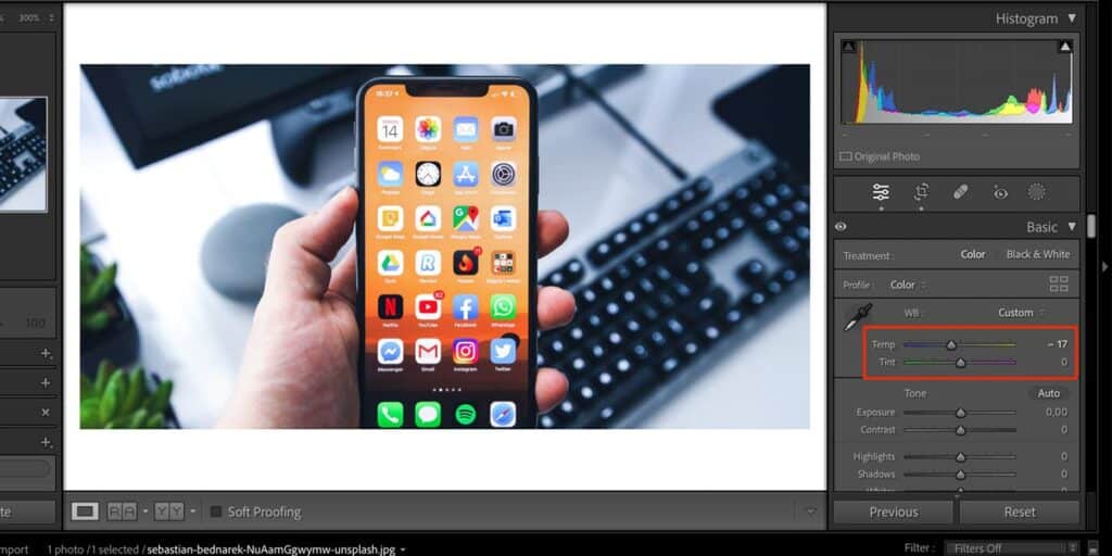
To change the white balance, let’s move the Temp and Tint sliders to the right to make the image warmer. You can also alter the Tint slider to fit your needs.
After moving our sliders, you can see that the white balance looks much more natural.

2. Use the Calibration Tool
The Calibration tool is also a powerful tool for coloring photos. Scroll to the bottom of your right-hand toolbar to find the feature.
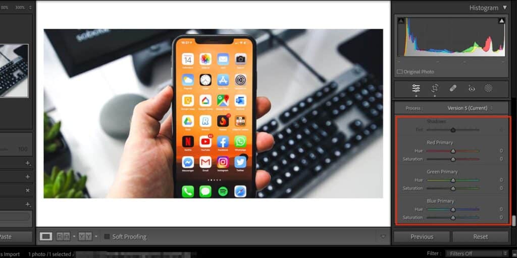
In the Calibration section, you’ll see a Shadows option, which is only available for certain images. Besides that, you can also use:
- Green Primary: Hue and Saturation
- Blue Primary: Hue and Saturation
- Red Primary: Hue and Saturation
You can tweak the sliders however you feel is necessary. Here’s the result after we slightly adjusted the Calibration feature; the changes are subtle but effective.

3. Implement Waveform and Histogram Graphs
A waveform is a graph displaying the luminance and chrominance information of a photo.
- The waveform shows the brightness levels of images, often with spatial representation. It assists in finding areas with excess brightness or darkness.
- It shows red, blue, and green channel numbers separately to check the presence level of the other channel. Lower or higher color channels will signify a potential color cast.
- Some waveforms display saturation information, allowing you to avoid oversaturated/undersaturated areas.
A histogram is a graph that represents the tone distribution of a photo. Its horizontal axis range, left to right, is displayed through black to white. The vertical axis shows the number of pixels at each tonal value.
- A histogram shifted left indicates underexposure, and a histogram shifted right indicates overexposure.
- A narrow histogram signals low contrast, and a wide histogram signals high contrast.
- Peaks in the far right or left of the image signify loss of details in highlights or shadows.
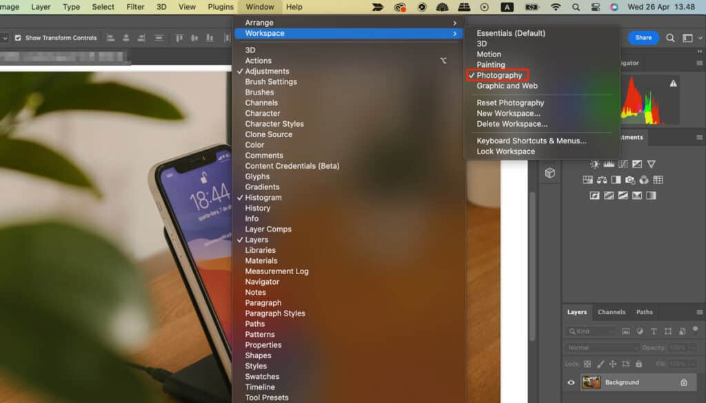
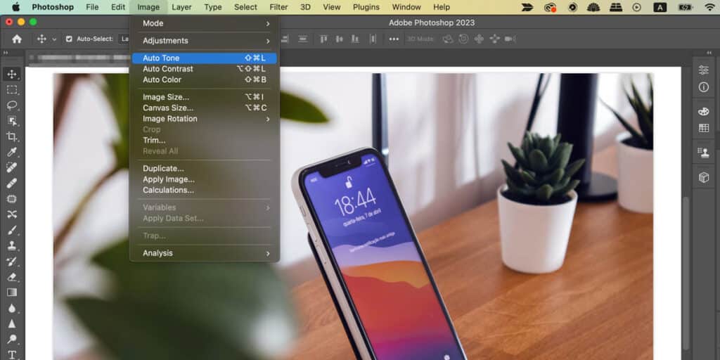
4. Use Auto Color in Photoshop
Auto Coloring is a handy one-click option for color correction in Photoshop. Sometimes, it lacks accuracy, but you’ll better understand the changes you need to make.
- Open Photoshop
- Go to the Workspace (toolbar at the top)
- Click on Photography.
- Go to Image
- Auto Color
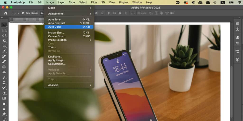
If you feel like your photo still requires some extra adjustments, you can hit the Auto Tone option as well. Go to the Image tab, and you’ll again find it there.
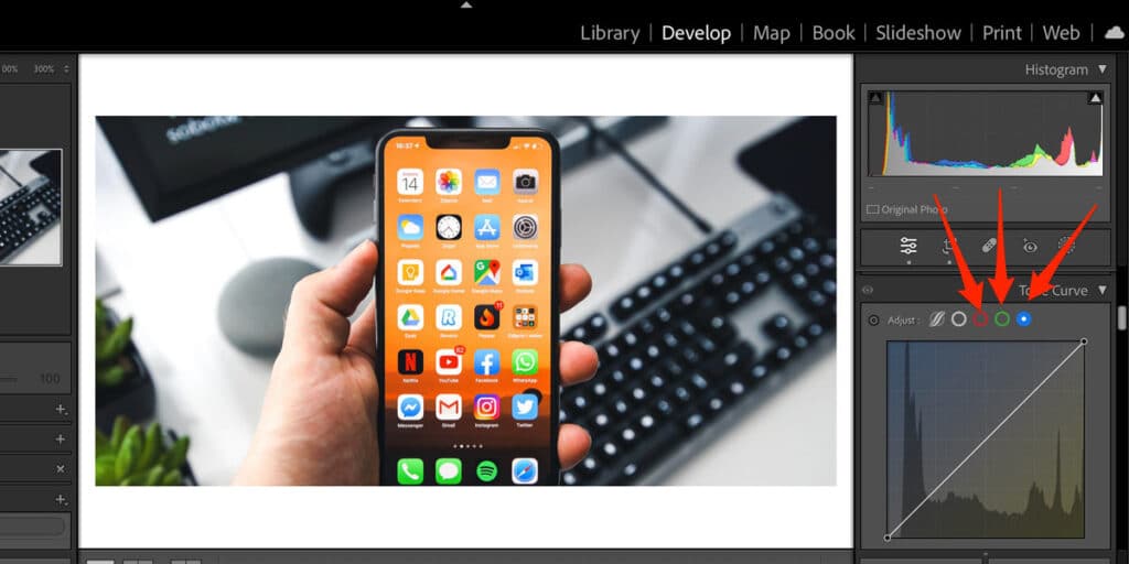
5. Adjust Your Color Tone Curves
The Tone Curve tool, used for adding matte and other styles, can also be used for color-correcting photos. When using tone curves for color-correcting post-production, you have three options as follows.
- Red: Adjusts reds and aqua,
- Blue: Adjusts blue and yellow,
- Green: Adjusts green and magenta.
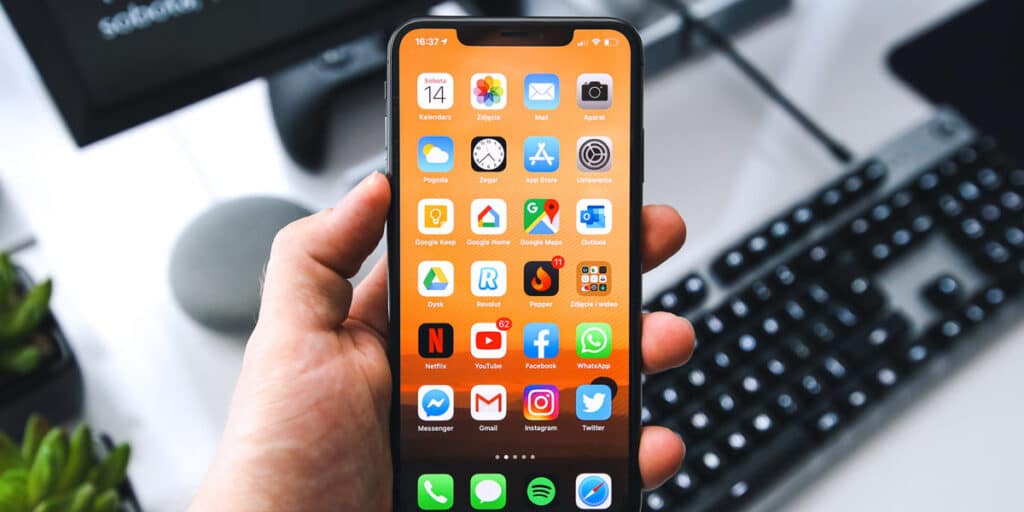
To use these tools, go to the Tone Curve section. In Lightroom, you’ll find it on the right-hand side. When you’re there, click on the colors you want to adjust; the screenshot below will help you find what you’re looking for.
You can adjust the curves just as you would when using the Tone Curve tool for light. If you want to alter specific parts of the picture, tap the circle in the top left of this section before clicking on a certain area of the image. Then, drag the line up and down.
Below, you’ll see the picture we’ve edited with curves adjusted:
6. Use Masks and Vignettes
Masking and vignettes are used for selective color correction when any specific parts need color adjustments. First, create a mask to isolate those specific parts from the image. Then apply any color adjustments, and it will affect the masked areas. Vignettes are effects that brighten or darken corners and edges of a photo so that the viewers are naturally drawn to the center.
7. Use the HSL Sliders
HSL stands for hue, saturation, and luminance, and these sliders are the most common color correction method. You can use the HSL sliders to adjust specific colors in your pictures without impacting how the others look, which is different from the standard Vibrance and Saturation tools.
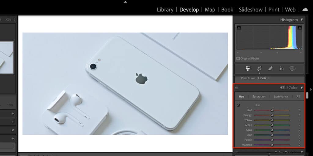
In Lightroom, you can use the HSL sliders for 8 different colors: Red, Blue, Green, Aqua, Magenta, Yellow, Orange, and Purple. When color correcting, you will find that the luminance slider is especially useful for instances where your picture looks too warm or cool. Try other options to see how they impact the colors that require adjusting.
After going to the HSL/Color tab, you’ll find the options for altering hue, saturation, and luminance. It doesn’t matter if you select HSL or Color; the only difference is the layout. Below, you can see the image we’ve color-corrected with the HSL / Color tab. The original image could’ve been more accurate with the blues and yellows, so we’ve adjusted those areas accordingly, along with tweaking the aqua and green sections.

8. Adjust Highlights, Midtones, and Shadows
Highlights and midtones stand for specific color ranges within the tonal spectrum of a photo, used for controlling contrast and exposure. Highlights refer to the amount of white an image has. Adjusting highlights reduces overexposed areas. Mid-tones refer to middle-range tones, neither bright nor dark. They contain most of the details of the photographs. Adjusting midtones changes the overall brightness and contrast of the image. Shadows are the darkest areas, adjusting which impacts the underexposed areas for depth.
9. Choose a Specific Color Grade
Another method to apply correction is to choose a specific color grading for creating a certain style or mood, ensuring consistency, or developing a story. It involves several adjustments as follows.
- Modifying the luminance of a specific color
- Increasing or decreasing saturation
- Altering the base colors
- Changing all colors to a specific temperature or tint (warm, golden, or bluish)
- Using pre-designed or custom color palettes, etc.
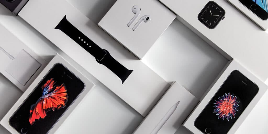
10. Vibrance and Saturation
Vibrance and Saturation sliders can be used to make simpler adjustments. Saturation adds more colors to your entire photo, whereas Vibrance only targets areas where it feels some additional support is necessary.
Saturation and Vibrance exist in most high-end photo editing tools, including Lightroom and Capture One. In Lightroom, you’ll find these two sliders under the Basic section on the right-hand side.
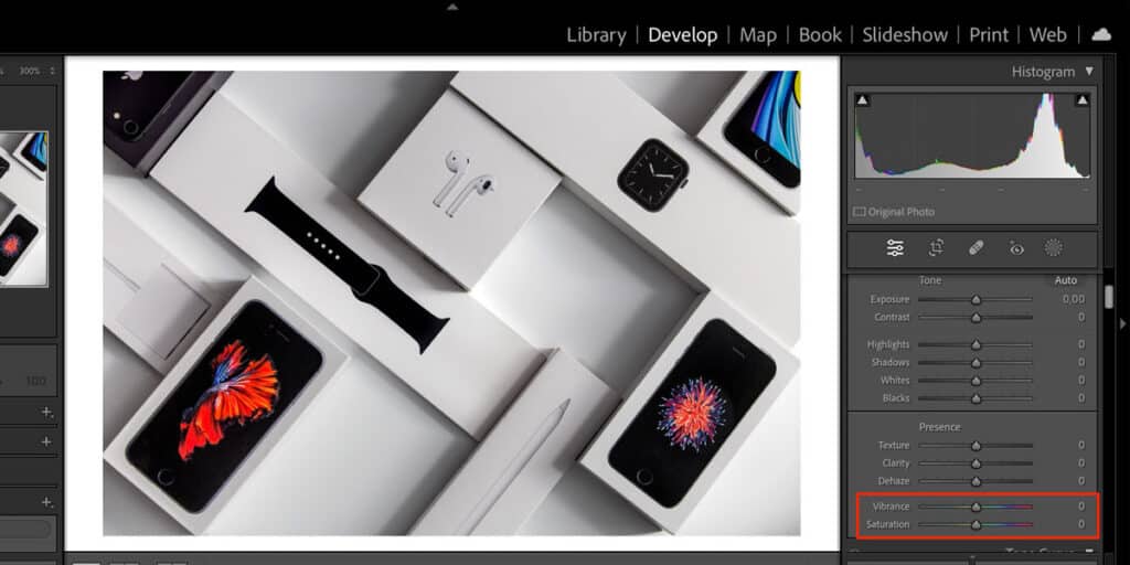
The image that we’re editing right now is a little too warm, so we’re going to slightly reduce the saturation and vibrance that you see. To do this, you can either drag the sliders to the left or enter the amount you want to change them to in the number box.
After tweaking the vibrance and saturation sliders, you can see the result below.
What are the Common Mistakes to Avoid in Photo Color Correction?
Common mistakes to avoid in photo color correction are unintentional and unnatural appearance of parameters such as colors, saturation, contrast, vignette effect, etc. When these parameters are present more or less than necessary, they create images far from a realistic or artistic look. There are 8 common mistakes that you should avoid while editing your images as follows.
Mistake 1: Avoiding the Image Culling Process
Image culling is an essential step to start the coloring process and to save time from being wasted. Photo culling creates a smooth workflow by shortlisting the best images and optimizing storage.
Solution: Cull your photos before you start editing images. This process will ensure the best-looking images for better output.
Mistake 2: Skipping the Calibration
A calibrated display (monitor or camera) represents color. It aligns with the display sensors, ensuring color consistency as required. Working with uncalibrated results in color inadequacy in visuals, inaccurate rendering, and color differences in photos.
Solution: Calibrate the monitor, camera, or other screen displays regularly, use a calibration device, and software for making accurate colors and tones.
Mistake 3: Performing Over-Editing in Photos
Using unconditional use of saturation, contrast, or hue creates an unnatural look in images and causes a loss of detail. Oversaturation makes a garish color effect in a photo, and excess use of contrast destroys shadows or highlights.
Solution: Make subtle changes and watch out for appearances to maintain an authentic and balanced look.
Mistake 4: Not Adjusting White Balance
White balance can create unexpected color casts in photos. Photos will appear excessively cool or warm. It harms images containing humans, as the skin tone appears unreal.
Solution: Use a neutral reference for white balance adjustment to ensure accurate colors.
Mistake 5: Lacking Understanding of Color Theory
The proportionate presence of colors is necessary to captivate viewers. Otherwise, photos will turn out as visually unappealing. It is harmful for product photography promotion and marketing, as viewers will get misleading information.
Solution: Study on understanding color in photography, color wheel, complementary colors, and color harmonies for commercial-grade service.
Mistake 6: Avoiding the Histogram
Visual judgments aren’t enough to make subject changes. Using a histogram creates a graph showing the distribution of colors and tones in photos. Otherwise, photos might contain imbalanced use of tones and color variations on different devices.
Solution: Use histograms and scopes for objective feedback about color changes.
Mistake 7: Having a Craze for New Tools/Features
Every software updates its features, tools, presets, and filters, keeping up with the ongoing demands. Without mastering fundamental techniques, the arbitrary use of new tools and features to colorize photos will cause harm.
Solution: After implementing fundamentals, use new features moderately.
What is the Most Efficient Photo Color Correction Software?
The most efficient photo color correction software is Adobe Photoshop, for its granular control of diverse tools to colorize images. It offers precision over the color correction photo editing process. Photoshop contains levels/curves, vibrance/saturation, exposure, filters, color balance, and hue/saturation to apply color correction professionally. Other color correction software includes Adobe Lightroom, Skylum Luminar Neo, PaintShop Pro, and DxO PhotoLab.
- Adobe Lightroom features for color correction: Color Mix Panel, White Balance, HSL/Color Sliders, Tone Curve, Vibrance/Saturation, etc.
- Skylum Luminar Neo features for color correction: Manual Color Controls, HSL Panel, Color Harmony, etc.
- PaintShop Pro features for color correction: Hue/Saturation/Lightness Adjustments, Selective Color, Color Replacement, etc.
- DxO PhotoLab features for color correction: Tone Curve, Exposure/Contrast/Microcontrast, White Balance, ColorWheel, HSL Adjustments, LUTs, etc.
How Does Photo Color Correction Improve Product Images?
Photo color correction improves product images by creating high-quality, visually pleasing, and professional-looking images that resemble the originals. Consistent-looking product images build viewers’ trust, establish a brand’s reputation, and increase sales.
1. Color Correction Builds Trust Among Consumers
Color differences cause viewers’ discrepancies. A photo editor addresses this factor well and adjusts the colors in a product image to maintain a professional look. When published online, the similarities build buyers’ credibility in the products, and they stick to purchasing them over the competitor’s products.
2. Professionally Edited Color Establishes Brand’s Authenticity
Consumers assume a product’s quality by its look. That’s why brands and businesses heed the appearance of their products. Buyers trust the brands that maintain coherence and an authentic look of the products, similar to the physical ones. Professional color editing attracts viewers with eye-catching looks, increasing the brand’s value and recognition.
3. Color Adjustment Elevates Product Images for the E-commerce Industry
Professionally edited colors resemble original products, maintaining brand consistency in both physical and digital versions. As the color-correcting process achieves color fidelity perfectly, it reflects the actual shades, hues, and tones of the physical product. This cohesive visual identity assures buyers of the products’ quality, functionality, and serviceability for the long term.
4. Actual Color Representation Impacts On Buyers’ Mindset
The right presentation of product color makes a positive impression on the buyer’s mind in the following ways.
- Creates visual impact with quality, look, and potential benefits.
- Attach viewers’ emotions with an urge to own the products.
- Supports brand guidelines and stories with the right mood and tone.
5. Colors’ Impact on Products’ Repeat and New Sales
Accurate color presentation impacts buyers’ buying perception. It meets their realistic expectations of the product, maintains business guidelines on consistency, and increases new sales along with repeat customers. Products that look similar assist in reducing product return rates.
What are the Types of Color Correction Used in Product Photography?
The types of color correction used in commercial product photography include matching product colors, changing product colors, changing product background color, and creating inversion for the product.
- Matching product colors: Matching product colors is the process of adjusting image color, temperature, tint, saturation, and brightness to make the product appear similar to the original physical product.
- Changing product colors: Changing product colors is the process of creating several products of the same shape, brand, and size. It displays products’ consistency and variation to attract potential customers’ interest.
- Changing product background colors: Changing the background opens a place for adding a new background or keeping the background transparent for multiple uses. Sticking to a color is a mandatory guideline for e-commerce product image guidelines.
- Creating color inversion in the product images: Inverting colors is used for creative effects, correcting image issues, and assisting some individuals with visual impairments.
What Types of Products Need Photo Color Correction?
Products that are listed on e-commerce websites, online stores, Shopify stores, and social media shops need photo color correction to show variation and attract target customers. Considering this context, almost all types of products need photo color correction, from clothing, jewelry, shoes, cosmetics, and perfumes to electronic gadgets, hand-made items, car and automobile products, and home improvement products, among others.
How to Get Photo Color Correction Improved?
To get photo color correction improved, hire professional photo color correction service providers. They have plenty of experience, expertise, manpower, the latest advanced technology, and software to support clients’ business-specific needs. Photo color correction is mostly used in e-commerce product listings to display product variations accurately. When an e-commerce seller needs bulk editing, urgent project completion, or looks for long-term collaboration instead of frequent hassle, outsourcing photo color correction service saves time and offers budget-friendly and brand-specific, tailored solutions.
How Much Does a Color Correction Cost in New York, USA?
The photo color correction cost starts at $0.99 in New York, USA. The cost of color correction is subject to change due to project complexity, volume, types of color correction, etc. Professional image color correction service is offered in 3 categories, and the pricing structure varies as follows.
| Types of Color Correction | Pricing | Service Covers |
|---|---|---|
| Basic Color Correction | Starts at $0.99 | White balance adjustment, Basic exposure adjustment, Saturation & contrast, Work on the brightness level. |
| Medium/Professional Color Correction | Starts at $1.99 | Advanced color tone balancing, Comprehensive exposure correction, Detailed saturation refinement, Complex white balance adjustments . |
| High-end Color Correction | Starts at $2.50 | Professional-grade color grading, Advanced channel mixing techniques, Precise color temperature adjustment, Complex lighting condition corrections. |
| Custom Color Correction | Decided on what customers need. | |
FAQs About Image Color Correction
When should you use photo color correction?
You should use color correction when the colors in photos appear different from the original scene, and have issues in exposure, hue, saturation, and brightness. Start editing with color correction at the beginning of your edit to apply more advanced color adjustments.
What are the common color issues that need correction in photos?
Common color issues that need corrections in photos are desaturated images, incorrect white balance, overexposure, and underexposure.
How can you fix an incorrect white balance in a photo?
You can fix an incorrect white balance in your photo by altering the Temperature and Tint tabs in your post-production software. Other than that, you can fix the white balance in a photo with the HSL sliders.
What are some techniques for enhancing colors in a photo?
Some color enhancement techniques used in a photo include the Vibrance and Saturation tabs, along with the Calibration sliders in Lightroom and Camera Raw. Or, use color grading wheels to adjust specific areas within your picture, once you’ve made basic adjustments.
Final Overview
- Color correction is the process of adjusting the colors in photo editing software to create better-looking images.
- Color correction differs from color grading in terms of purpose. Color correction removes color differences and flaws, whereas color grading is applied for artistic photos.
- The most efficient software used for color correction is Adobe Photoshop, Adobe Lightroom, Skylum Luminar Neo, PaintShop Pro, and DXO PhotoLab.
- Professionally edited color correction ensures a realistic look, removes color flaws, and convinces viewers.
- The price for professional image color correction starts at $0.99 in the USA.
